> For the complete documentation index, see [llms.txt](https://docs.globo.io/llms.txt). Markdown versions of documentation pages are available by appending `.md` to page URLs; this page is available as [Markdown](https://docs.globo.io/globo-b2b-bulk-order/collection-quick-order/icon-on-image.md).

# Add a cart icon on product images

Use the Floating template to put a round cart icon on each product image, so buyers add to cart or pick a variant straight from your collection pages.

This guide sets up Collection Quick Order with the **Floating** template (**Icon on image**), from creating the form to checking it on your storefront. When you're done, each matching product card shows a round cart icon on a corner of its image. For a product with one variant, clicking the icon adds it to the cart. For a product with several variants, it opens a list of variants, and clicking one adds it to the cart.

## Before you start

* Turn on the **Globo Bulk Order** app embed in your theme. Without it, nothing appears on your storefront. On the app's Dashboard, in the **Quick Setup Guide**, click **Activate app embed**. Your theme editor opens with **Globo Bulk Order** turned on. Click **Save** there. For details, see [Enable the app embed](/globo-b2b-bulk-order/getting-started/enable-app-embed.md).
* You don't need an app block or a shortcode. The app finds the product cards in your theme's product grids and adds the icon by itself.
* The icon sits on the product image of each card. If the app can't find the image on your theme's cards, it shows the icon below the price instead. In that case, [contact support](/globo-b2b-bulk-order/help/contact-support.md) so we can check your theme.
* Prefer a full button with a variant dropdown under each product? See [Add a button below products](/globo-b2b-bulk-order/collection-quick-order/button-below-product.md).

## Create the form and choose products

{% stepper %}
{% step %}

### Open Collection Quick Order

In Shopify admin, go to **Apps** > **Globo B2B Bulk Order**, then click **Collection Quick Order** in the app navigation.
{% endstep %}

{% step %}

### Create a new form

Click **Create form**. The builder opens with the name **Quick Buy Collection** and an **Active** badge at the top.

You can also open the builder from the app's Dashboard: in **Bulk order tools**, click **Create form** on the **Collection Quick Order** card.

To rename the form, click the name field above the preview and type a new name, for example `Image icons - wholesale`. Buyers never see the name.

The builder has three tabs on the left: **Products**, **Customize** and **Visibility**. The preview on the right shows up to three product cards and updates as you change settings.
{% endstep %}

{% step %}

### Choose the products

The builder opens on the **Products** tab (heading **Product targeting**). Pick which products get the icon:

| Option                                     | Which product cards get the icon                                                                                  |
| ------------------------------------------ | ----------------------------------------------------------------------------------------------------------------- |
| **All products** (selected for a new form) | Every product card the app finds. The banner reads **All products in your store will be displayed in this form.** |
| **Specific products**                      | Only the products you pick.                                                                                       |
| **Conditions**                             | Products that match your rules.                                                                                   |

**Specific products:** click **Add products**, select products in the Shopify product picker (for example **Enamel Lapel Pin** and **Printed Ankle Socks**), then click **Select**. To pick from a collection instead, click **Add from collection**, choose a collection such as **Wholesale Essentials**, tick the products you want and click **Add products**, or click **Add all products** to take the whole collection.

**Conditions:** under **Products must match:**, choose **All conditions** or **Any condition**. Then set each rule's field, operator and value, for example **Product tag** **contains** `accessories`. Click **+ Add another condition** for more rules. A new form starts with the rule **Product title** **is not equal to** and an empty value, and every rule needs a value before you can save. For every field and operator, see [Product conditions](/globo-b2b-bulk-order/targeting-and-design/customer-and-product-targeting.md#product-conditions).
{% endstep %}
{% endstepper %}

## Customize the icon

Click the **Customize** tab. It has four sections, in this order: **Template**, **Show columns**, **Style** and **Custom CSS**.

### Template

Select **Floating** (**Icon on image**). A new form starts with **Classic**, so you need to change it.

### Show columns

With the **Floating** template, the columns decide what appears around the icon:

| Column          | What buyers see                                                                                                                                                                                           | Shown for a new form? |
| --------------- | --------------------------------------------------------------------------------------------------------------------------------------------------------------------------------------------------------- | --------------------- |
| **Variant**     | Nothing extra on the card. This column only controls whether the **Variant dropdown** style settings appear. Products with more than one variant always open the variant list when buyers click the icon. | Yes                   |
| **Quantity**    | A quantity box joined to the icon. Buyers type a number. It starts at 1 and has no **-** and **+** buttons in this layout.                                                                                | Yes                   |
| **Stock**       | The stock label next to each variant's price in the variant list, for example `Only 1 left`. Products with one variant have no list, so they show no stock label.                                         | No                    |
| **Add to cart** | The icon itself. You can't hide it.                                                                                                                                                                       | Yes                   |

* **Hide a column:** click the **x** on its chip.
* **Show a hidden column:** click **Add column**, then tick it under **Hidden columns**.

The order of the chips doesn't change the Floating layout. The **Show variants in a popover** and **Hide variant selector for single-variant products** checkboxes belong to the **Classic** template and don't appear here.

### Style

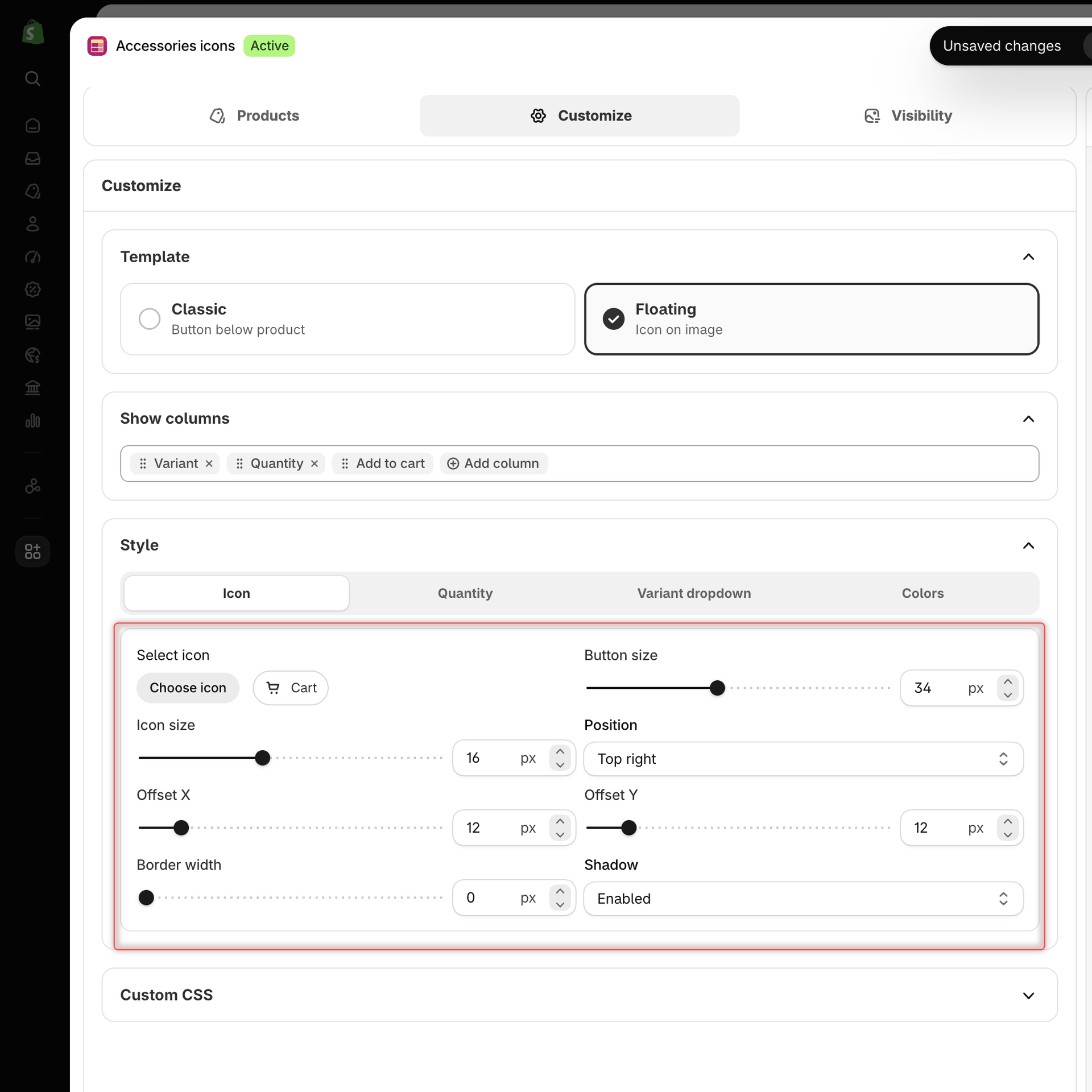
**Style** has a row of sub-tabs: **Icon**, **Quantity** (while the **Quantity** column is shown), **Variant dropdown** (while the **Variant** column is shown) and **Colors**.

On the **Icon** sub-tab:

| Setting          | What it does                                                                                                                                                           | Default       |
| ---------------- | ---------------------------------------------------------------------------------------------------------------------------------------------------------------------- | ------------- |
| **Select icon**  | Click **Choose icon**, then pick **None**, **Cart**, **Plus** or **Arrow**. With **None**, the button shows its text, for example **Add to Cart**, instead of an icon. | **Cart**      |
| **Button size**  | Width and height of the round button, up to 80 px.                                                                                                                     | 34 px         |
| **Icon size**    | Size of the icon inside the button, up to 40 px.                                                                                                                       | 16 px         |
| **Position**     | The corner of the product image: **Top right**, **Top left**, **Bottom right** or **Bottom left**.                                                                     | **Top right** |
| **Offset X**     | Distance from the left or right edge of the image, up to 100 px.                                                                                                       | 12 px         |
| **Offset Y**     | Distance from the top or bottom edge of the image, up to 100 px.                                                                                                       | 12 px         |
| **Border width** | Border around the button, up to 10 px.                                                                                                                                 | 0 px          |
| **Shadow**       | **Enabled** or **Disabled**. Also applies to the quantity box.                                                                                                         | **Enabled**   |

<figure><img src="https://4205698016-files.gitbook.io/~/files/v0/b/gitbook-x-prod.appspot.com/o/spaces%2FcOPpR31lfLzPdPWnPtOU%2Fuploads%2Fgit-blob-dbff5d9043ad0cd435742c8eed24b8f5adde66e4%2Fscreenshot-collection-quick-order-style-floating-icon.png?alt=media" alt="Collection Quick Order builder on the Customize tab with the Floating template selected and the Style section open on the Icon sub-tab showing Select icon, Button size, Icon size, Position, Offset X, Offset Y, Border width and Shadow"><figcaption><p>Set the icon, its size and the image corner it sits in on the Icon sub-tab.</p></figcaption></figure>

The other sub-tabs:

| Sub-tab              | Settings (default)                                                                                                                                                                                                                                                                                                                                                                                                                            |
| -------------------- | --------------------------------------------------------------------------------------------------------------------------------------------------------------------------------------------------------------------------------------------------------------------------------------------------------------------------------------------------------------------------------------------------------------------------------------------- |
| **Quantity**         | **Width** (58 px), **Height** (34 px), **Gap** (0 px) between the box and the icon, **Text size** (16 px), **Text weight** (500), **Border radius** (20 px), **Border width** (1 px).                                                                                                                                                                                                                                                         |
| **Variant dropdown** | The variant list: **Panel width** (260 px), **Row height** (24 px), **Text size** (12 px), **Text weight** (600), **Border width** (1 px), **Shadow** (**Enabled**). These are the same settings as **Variant popover** in the **Classic** template, so changing one changes the other.                                                                                                                                                       |
| **Colors**           | **Icon**: **Background color** (`#111111`), **Icon color** (`#ffffff`), **Border color** (`#111111`). **Quantity**: **Background color** (`#ffffff`), **Border color** (`#111111`), **Text color** (`#111111`). **Variant dropdown**: **Background color** (`#111111`), **Text color** (`#ffffff`), **Divider color** (`#ffffff`), **Hover background color** (`#2a2a2a`), **Selected background** (`#2a2a2a`), **Border color** (`#ffffff`). |

Text weight goes from 0 to 1000. Click a color to open the color picker. For more on these settings, see [Design & custom CSS](/globo-b2b-bulk-order/targeting-and-design/design-and-custom-css.md).

{% hint style="info" %}
The preview always shows the icon in the top-right corner of each card. **Position**, **Offset X** and **Offset Y** apply only on your storefront, so check them there after you save.
{% endhint %}

### Custom CSS

This section starts collapsed. Click **Custom CSS** to open it, then type CSS in the box. Under **Available CSS classes**, click a class to add it to the box, for example:

| Class                                              | Description                           |
| -------------------------------------------------- | ------------------------------------- |
| `.samitaBO-collection-quick-buy-floating-toggle`   | **Floating icon toggle button**       |
| `.samitaBO-collection-quick-buy-floating-quantity` | **Floating panel quantity stepper**   |
| `.samitaBO-collection-quick-buy-floating-panel`    | **Floating variant panel**            |
| `.samitaBO-collection-quick-buy-floating-option`   | **Floating panel variant option row** |

The preview applies your CSS as you type. On your storefront, your CSS is added to the page as written, so it applies to every Collection Quick Order on the page and to anything else your selectors match. Start your selectors with the classes above so they don't change other parts of your theme.

## Choose who sees the icon and where

Click the **Visibility** tab. It has two sections: **Customer targeting** and **Display location**.

### Customer targeting

Choose an option under **Who can see this form?**:

| Option                       | Who sees the icon                                                                              |
| ---------------------------- | ---------------------------------------------------------------------------------------------- |
| **All customers** (default)  | Everyone, logged in or not.                                                                    |
| **Logged-in customers only** | Only customers who are logged in to their account.                                             |
| **Guest customers only**     | Only visitors who aren't logged in.                                                            |
| **Customers with tags**      | Logged-in customers who have at least one of the tags you add under **Include customer tags**. |

To add a tag, click **Add customer tag**, then tick an existing tag or type a new one, for example `wholesale`. Tags must match the customer's tag exactly, including capital letters.

Use **Exclude customer tags** to hide the icon from customers with any of those tags, for example `retail`. This field isn't shown with **Guest customers only**.

For more examples, see [Customer & product targeting](/globo-b2b-bulk-order/targeting-and-design/customer-and-product-targeting.md).

### Display location

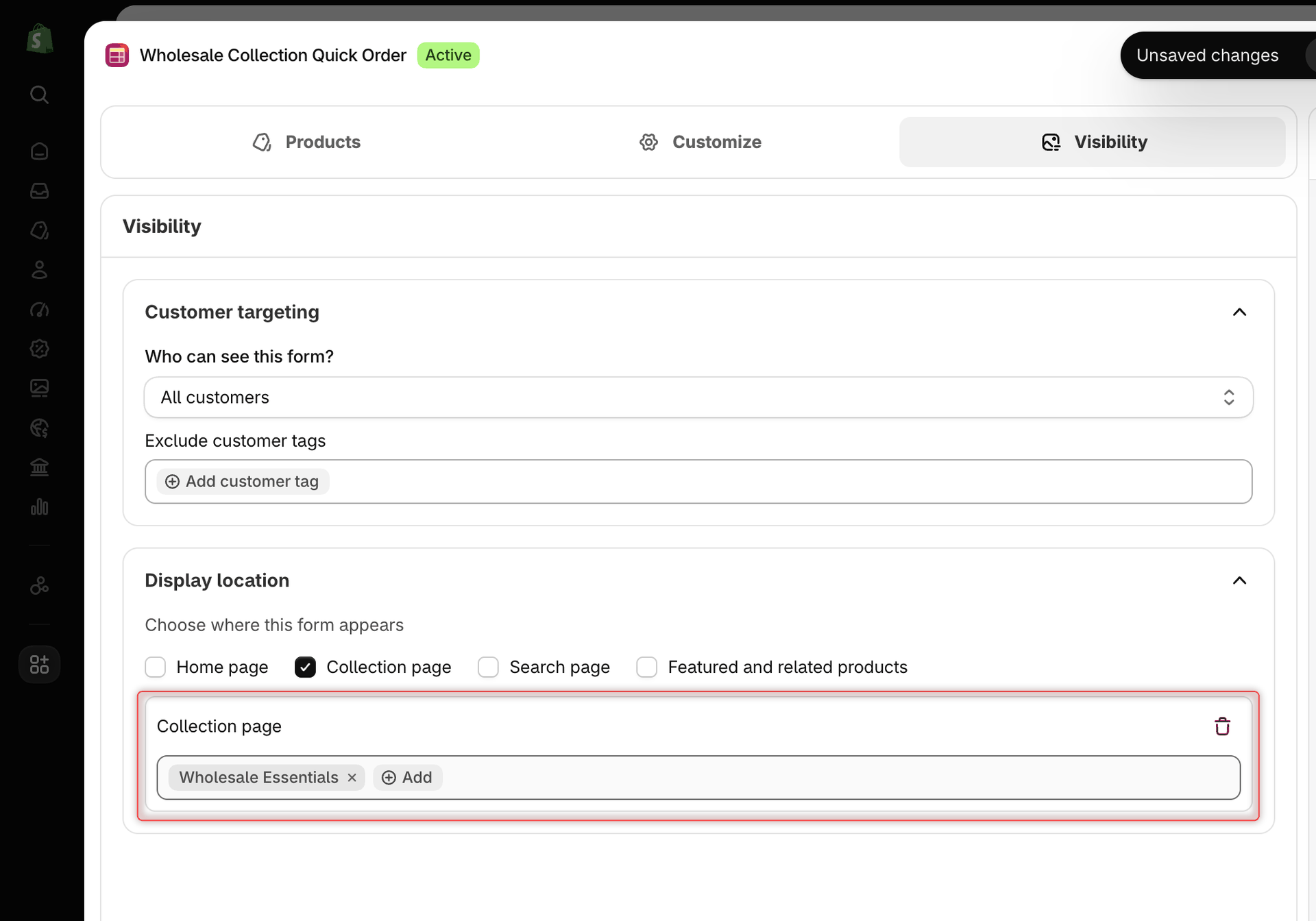
Under **Choose where this form appears**, tick the pages where the icon should show:

| Checkbox                          | Product cards it covers                                                                                   |
| --------------------------------- | --------------------------------------------------------------------------------------------------------- |
| **Home page**                     | Product grids on your home page, such as a featured collection.                                           |
| **Collection page**               | Collection pages. Click **Add** in the **Collection page** box to limit the icon to specific collections. |
| **Search page**                   | Search results.                                                                                           |
| **Featured and related products** | Product grids on product pages, such as related or recommended products.                                  |

For example, tick **Collection page**, click **Add** and choose **Wholesale Essentials**. The icon then shows only on that collection's page. To remove a location, untick it or click the trash icon in its box.

A new form has no location ticked and shows the banner **No display locations selected. This form will appear on all pages where the app can render it.** It then appears on every page with product cards, including other pages such as blog posts. Once you tick a location, the icon shows only on the pages you ticked.

The app never adds the icon inside your cart, menus or footer, or to the main product on its own product page.

<figure><img src="https://4205698016-files.gitbook.io/~/files/v0/b/gitbook-x-prod.appspot.com/o/spaces%2FcOPpR31lfLzPdPWnPtOU%2Fuploads%2Fgit-blob-bc95edae4d2ba21f1c82cabfdbe0f9b28a7c03d8%2Fscreenshot-collection-quick-order-visibility-display-location.png?alt=media" alt="Collection Quick Order builder on the Visibility tab with Collection page ticked under Display location and the Wholesale Essentials collection added"><figcaption><p>Tick Collection page and add a collection to show the controls only on that collection.</p></figcaption></figure>

## Activate and save

{% stepper %}
{% step %}

### Check the status

At the top of the builder, make sure **Active** is selected. Choose **Draft** if you aren't ready to publish yet. Draft forms never appear on your storefront.
{% endstep %}

{% step %}

### Save the form

Click **Save** in the save bar at the top of the screen. The message **Form created** confirms it. The builder stays open, so you can keep editing. Later saves show **Form updated**.

If something is missing, a red banner titled **There are errors with this collection:** lists the problems, and the builder opens the tab with the first one:

| Message                                            | How to fix it                                                                                                     |
| -------------------------------------------------- | ----------------------------------------------------------------------------------------------------------------- |
| **Name can't be blank**                            | Enter a name in the name field above the preview.                                                                 |
| **Select at least one product**                    | On **Products**, add a product or choose another option.                                                          |
| **Enter value for Product title is not equal to.** | On **Products**, fill in the value of that condition. The message names the field and operator of the empty rule. |
| **Add at least one customer tag**                  | On **Visibility**, add a tag under **Include customer tags**.                                                     |
| {% endstep %}                                      |                                                                                                                   |

{% step %}

### Check your storefront

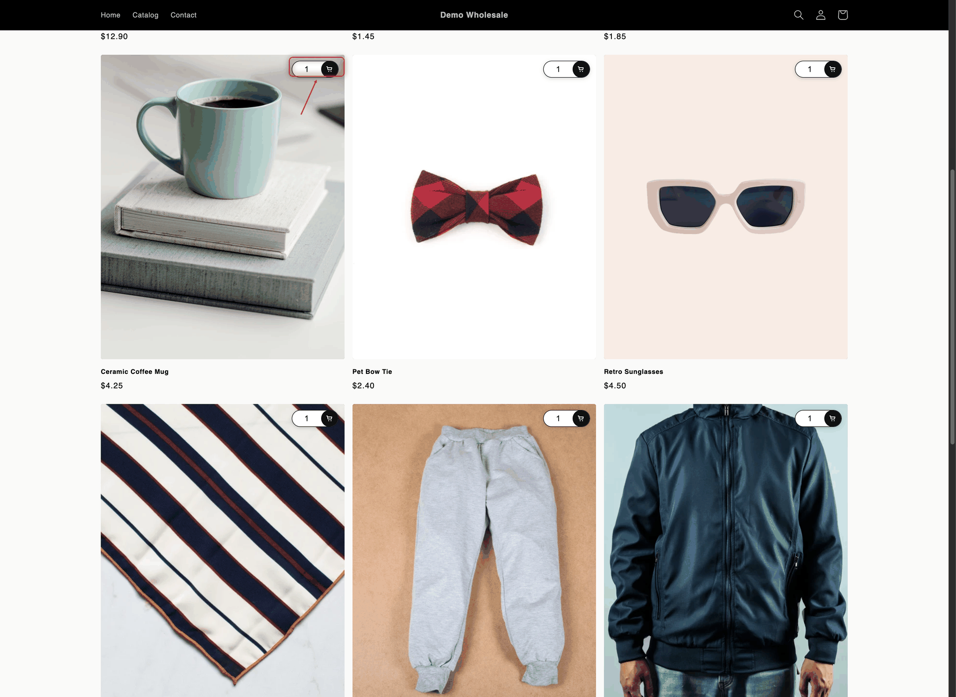
Open a page you picked in **Display location** on your online store, for example the **Wholesale Essentials** collection page. If you limited the form to tagged customers, log in as a customer with that tag first. It can take a few moments after saving for the icon to appear, so refresh the page if you don't see it yet.

Each matching product card now shows the icon in the corner you chose, with the quantity box next to it while the **Quantity** column is shown.

<figure><img src="https://4205698016-files.gitbook.io/~/files/v0/b/gitbook-x-prod.appspot.com/o/spaces%2FcOPpR31lfLzPdPWnPtOU%2Fuploads%2Fgit-blob-cc8b8801964c5e77ea99e83c59345ac285407d34%2Fscreenshot-storefront-collection-quick-order-icon.png?alt=media" alt="Wholesale Essentials collection page where each product image has a round black cart icon with a quantity box in its top-right corner"><figcaption><p>With the Floating template, a cart icon sits on a corner of each product image.</p></figcaption></figure>
{% endstep %}
{% endstepper %}

{% hint style="warning" %}
Icon not showing? Check that the **Globo Bulk Order** app embed is on, the form is **Active**, the page is ticked in **Display location**, the product matches the **Products** tab, and you're viewing as a customer who matches **Customer targeting**. A card shows only one Collection Quick Order, so a newer form for the same product may show instead. See [When several forms match a product](/globo-b2b-bulk-order/collection-quick-order/overview.md#when-several-forms-match-a-product). More fixes are in [Troubleshooting](/globo-b2b-bulk-order/help/troubleshooting.md#collection-quick-order-buttons-dont-appear-on-product-cards).
{% endhint %}

## What buyers see

### Products with one variant

1. The buyer types a quantity in the box next to the icon, or leaves it at 1. If they enter more than the available stock, the app adds the available quantity.
2. They click the icon. The product is added to the cart right away: a spinner shows on the icon, then a check mark.
3. A message **Added to cart successfully** appears with a **View cart and checkout** link. The quantity goes back to 1 and the cart count updates. The cart drawer doesn't open on its own.

### Products with several variants

1. The buyer sets the quantity, then clicks the icon.
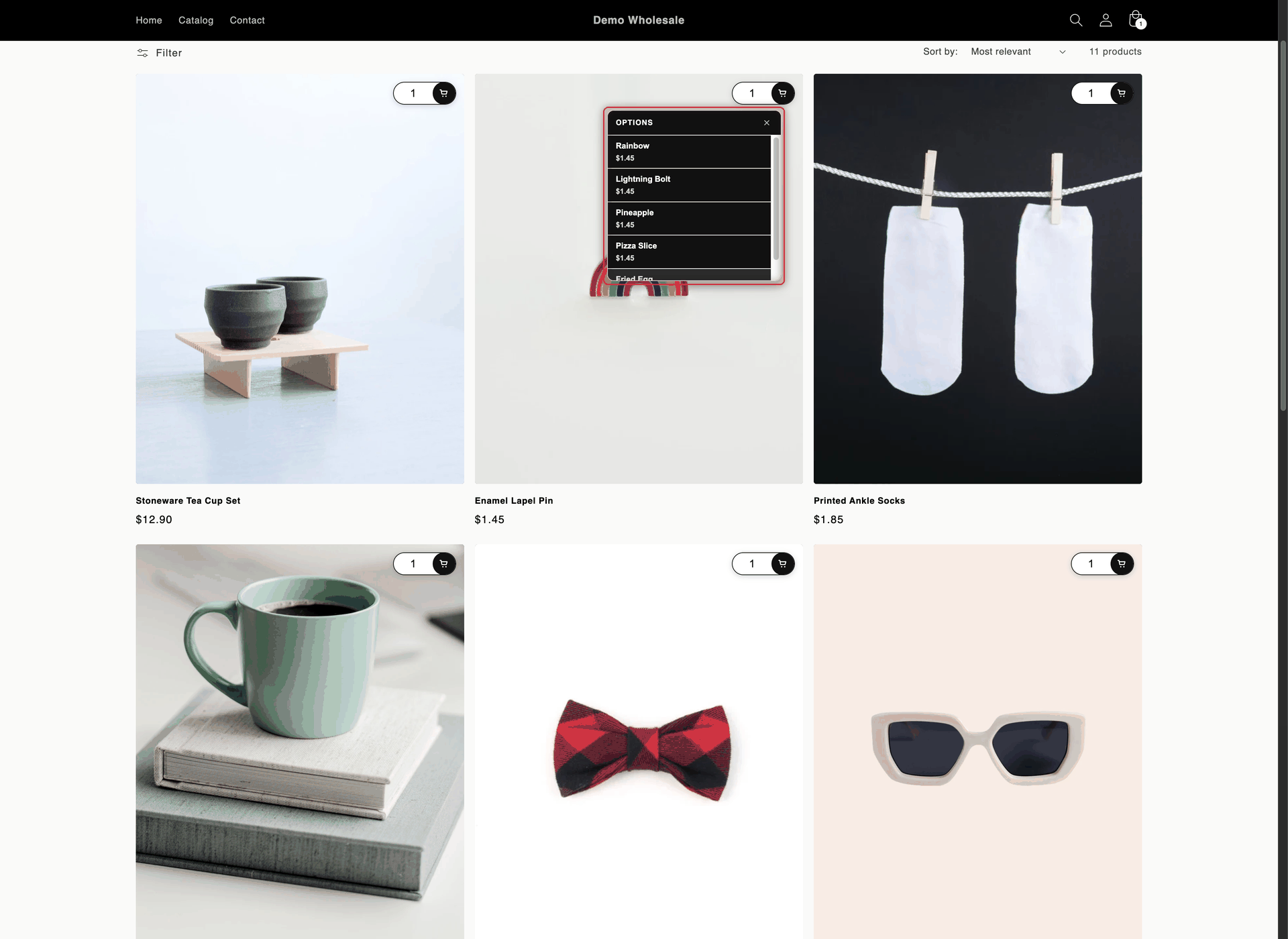
2. A list of the product's variants opens, for example the five designs of **Enamel Lapel Pin**. Each row shows a variant and its price, plus its stock label if the **Stock** column is shown. Sold-out variants show **Sold out** and can't be clicked.
3. The buyer clicks a variant. It's added to the cart right away with the quantity they set, the row shows a check mark, the **Added to cart successfully** message appears, and the list closes.

Buyers close the list without adding with the **×** button, by clicking outside it, or with the Esc key. When none of a product's variants is available, the icon is faded and can't be clicked. Screen readers announce the icon as **Add to Cart**, **Choose options** or **Sold out**.

<figure><img src="https://4205698016-files.gitbook.io/~/files/v0/b/gitbook-x-prod.appspot.com/o/spaces%2FcOPpR31lfLzPdPWnPtOU%2Fuploads%2Fgit-blob-4d9feca57e2652c3533161989a56ad365cd07618%2Fscreenshot-storefront-collection-quick-order-floating-popover.png?alt=media" alt="Enamel Lapel Pin product card with the variant list open below the cart icon, listing the Rainbow, Lightning Bolt, Pineapple and Pizza Slice designs with their prices, and the Fried Egg design partly visible below"><figcaption><p>For products with several variants, the icon opens a list and the chosen variant goes straight to the cart.</p></figcaption></figure>

### Change the wording

* **List and screen reader texts:** go to **Settings** > **Translations**, click the pencil icon (**Translate**) in the row of a language, and open the **Quick Buy Collection** section. There you can change **Add to cart**, **Sold out**, **Choose options**, **Options** (the list title for products without an option name), **Close** and **Added to cart successfully** (the message heading). See [Edit translations](/globo-b2b-bulk-order/settings/edit-translations.md).
* **Message text, link text and look:** the message's second line and its **View cart and checkout** link are in the **Toast** section of **Settings** > **Translations**. To change the message's colors, position and duration, or to turn it off, go to **Settings** > **Toast**. See [Toast notifications](/globo-b2b-bulk-order/settings/cart-notifications.md).

## Next steps

* [Add a button below products](/globo-b2b-bulk-order/collection-quick-order/button-below-product.md)
* [Customer & product targeting](/globo-b2b-bulk-order/targeting-and-design/customer-and-product-targeting.md)
* [Design & custom CSS](/globo-b2b-bulk-order/targeting-and-design/design-and-custom-css.md)
* [Stock thresholds](/globo-b2b-bulk-order/settings/stock-status.md)