> For the complete documentation index, see [llms.txt](https://docs.globo.io/llms.txt). Markdown versions of documentation pages are available by appending `.md` to page URLs; this page is available as [Markdown](https://docs.globo.io/globo-b2b-bulk-order/quick-order-form/customize-the-form.md).

# Customize the form

Set the heading, search and sort, columns, pagination and style of a Quick Order form, then check each change in the live preview and on your storefront.

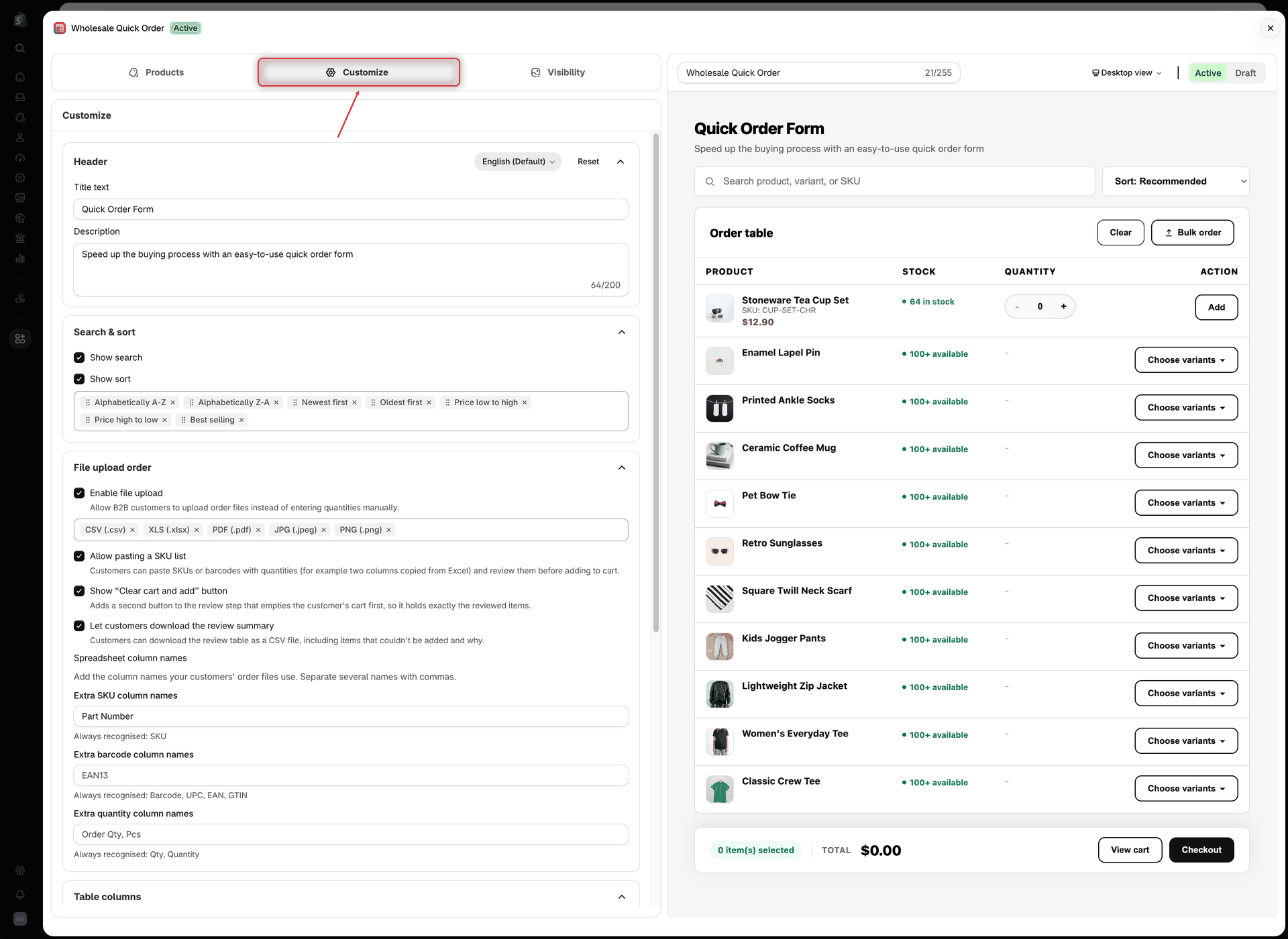
The **Customize** tab in the form editor controls what buyers see in a Quick Order form: the heading, the search box and sort menu, the table columns, how many products show per page, and the sizes and colors of the table and buttons. Each change shows in the live preview right away and reaches your storefront when you save.

## Before you start

* Create and save a Quick Order form. See [Create a Quick Order form](/globo-b2b-bulk-order/quick-order-form/create-a-form.md).
* To check your changes on the storefront, the form must be **Active** and placed on a page, and the **Globo Bulk Order** app embed must be on. See [Add the form to a page](/globo-b2b-bulk-order/getting-started/getting-started.md#add-the-form-to-a-page) and [Enable the app embed](/globo-b2b-bulk-order/getting-started/enable-app-embed.md).

## Open the Customize tab

{% stepper %}
{% step %}

### Open your Quick Order forms

In Shopify admin, go to **Apps** > **Globo B2B Bulk Order**, then click **Quick Order** in the app navigation. The **Quick Order Form** list opens.
{% endstep %}

{% step %}

### Open the form editor

In the form's row, click the edit (pencil) icon in the **Actions** column. The form editor opens in a full-screen window on the **Products** tab.
{% endstep %}

{% step %}

### Switch to Customize

In the left sidebar, click **Customize**. The tab has seven sections, in this order: **Header**, **Search & sort**, **File upload order**, **Table columns**, **Pagination**, **Style** and **Custom CSS**. Click a section's title to collapse or expand it. Every section starts open except **Custom CSS**.
{% endstep %}
{% endstepper %}

<figure><img src="https://4205698016-files.gitbook.io/~/files/v0/b/gitbook-x-prod.appspot.com/o/spaces%2FcOPpR31lfLzPdPWnPtOU%2Fuploads%2Fgit-blob-68de9acbf4c17f77b15ab351bdfe2b2a6cb5441f%2Fscreenshot-quick-order-customize-tab.png?alt=media" alt="Quick Order form editor with the Customize tab selected in the left sidebar, showing the Header and Search &#x26; sort sections next to the live preview of the form"><figcaption><p>The Customize tab shows its settings on the left and the live preview on the right.</p></figcaption></figure>

## How the live preview works

The preview on the right redraws a moment after each change. You don't need to save first.

* It shows a sample of your real products from the **Products** tab: the first products you picked (as many as **Products per page**), the products of your first collection, or a sample of your store's products. A preview page shows at most 50 rows. Stock badges follow **Settings** > **Stock thresholds**.
* You can expand a product's variants, use the page arrows and click **Load more**. Search, sort, quantities, **Add** and the **Bulk order** window don't work in the preview, so test those on your storefront.
* Use the view menu in the top bar to switch between **Desktop view** and **Mobile view**.

{% hint style="info" %}
The preview always uses the app's built-in English wording and your English **Title text** and **Description**. Text you change in **Settings** > **Translations** shows only on your storefront, and a few default labels differ: the preview's **Choose variants** button reads **Show variants** on your storefront, and the preview's **Compare at price** and **SKU** headers read **Compare At Price** and **Product SKU**.
{% endhint %}

## Header

| Setting         | What it does                                          | Default                                                              |
| --------------- | ----------------------------------------------------- | -------------------------------------------------------------------- |
| **Title text**  | The heading at the top of the form.                   | **Quick Order Form**                                                 |
| **Description** | A short line under the heading, up to 200 characters. | **Speed up the buying process with an easy-to-use quick order form** |

Both texts are saved per language. The language button at the right of the **Header** title shows the language you're editing. At first it's the language you use the app in, marked **(Default)**, for example **English (Default)**. To write the heading in another language, click the button, choose a language that is published on your store, and type over the **Title text** and **Description** (until you do, the fields show your default text). **Reset** puts the default title and description back for the selected language.

Buyers see the text for their storefront language. If a language has no text of its own, the form shows the English text. The form name in the editor's top bar is only for you: buyers never see it.

## Search & sort

| Setting         | What it does                                                                                                                                                         | Default |
| --------------- | -------------------------------------------------------------------------------------------------------------------------------------------------------------------- | ------- |
| **Show search** | Shows a search box above the table, with the placeholder **Search product, variant, or SKU**. Buyers type to filter the table by product name, variant title or SKU. | On      |
| **Show sort**   | Shows a sort menu above the table.                                                                                                                                   | On      |

If the form uses two or more collections on the **Products** tab, buyers also get a collection menu next to the search box, starting with **All collections**. It shows even when **Show search** and **Show sort** are off.

When **Show sort** is on, the chips under it choose which sort options buyers can pick, and in what order they appear in the menu:

* Drag a chip left or right to change its position in the menu.
* Click **×** on a chip to remove that option. The last chip can't be removed.
* Click **Add sort** to add a removed option back.

All seven options are on by default, in this order:

| Option in the editor   | What buyers see in the sort menu |
| ---------------------- | -------------------------------- |
| **Alphabetically A-Z** | **Name: A to Z**                 |
| **Alphabetically Z-A** | **Name: Z to A**                 |
| **Newest first**       | **Newest first**                 |
| **Oldest first**       | **Oldest first**                 |
| **Price low to high**  | **Price: Low to High**           |
| **Price high to low**  | **Price: High to Low**           |
| **Best selling**       | **Best selling**                 |

On the storefront, the menu always starts with **Sort: Recommended**, and that option is selected when the page loads. It keeps the order the products load in: the order of your product list on the **Products** tab, or each collection's own sort order. Your chips don't change this starting order; they only choose what else buyers can pick.

Some options don't currently change the order. **Best selling** always keeps the **Sort: Recommended** order. **Newest first** and **Oldest first** have no effect on a form that uses **Specific collections**. Remove those chips if they don't help your buyers.

## File upload order

This section lets buyers add many items at once through a **Bulk order** button, which appears next to **Clear** above the table. Turn on **Enable file upload** to let buyers upload an order file (CSV, XLSX, PDF or image), and **Allow pasting a SKU list** to let them paste SKUs or barcodes with quantities. Both are off by default. When either one is on, two more options appear, **Show “Clear cart and add” button** and **Let customers download the review summary**; with file upload on, you can also add **Spreadsheet column names**. Each option is explained step by step in [Let buyers upload an order file](/globo-b2b-bulk-order/quick-order-form/upload-an-order-file.md) and [Let buyers paste a SKU list](/globo-b2b-bulk-order/quick-order-form/paste-a-sku-list.md).

## Table columns

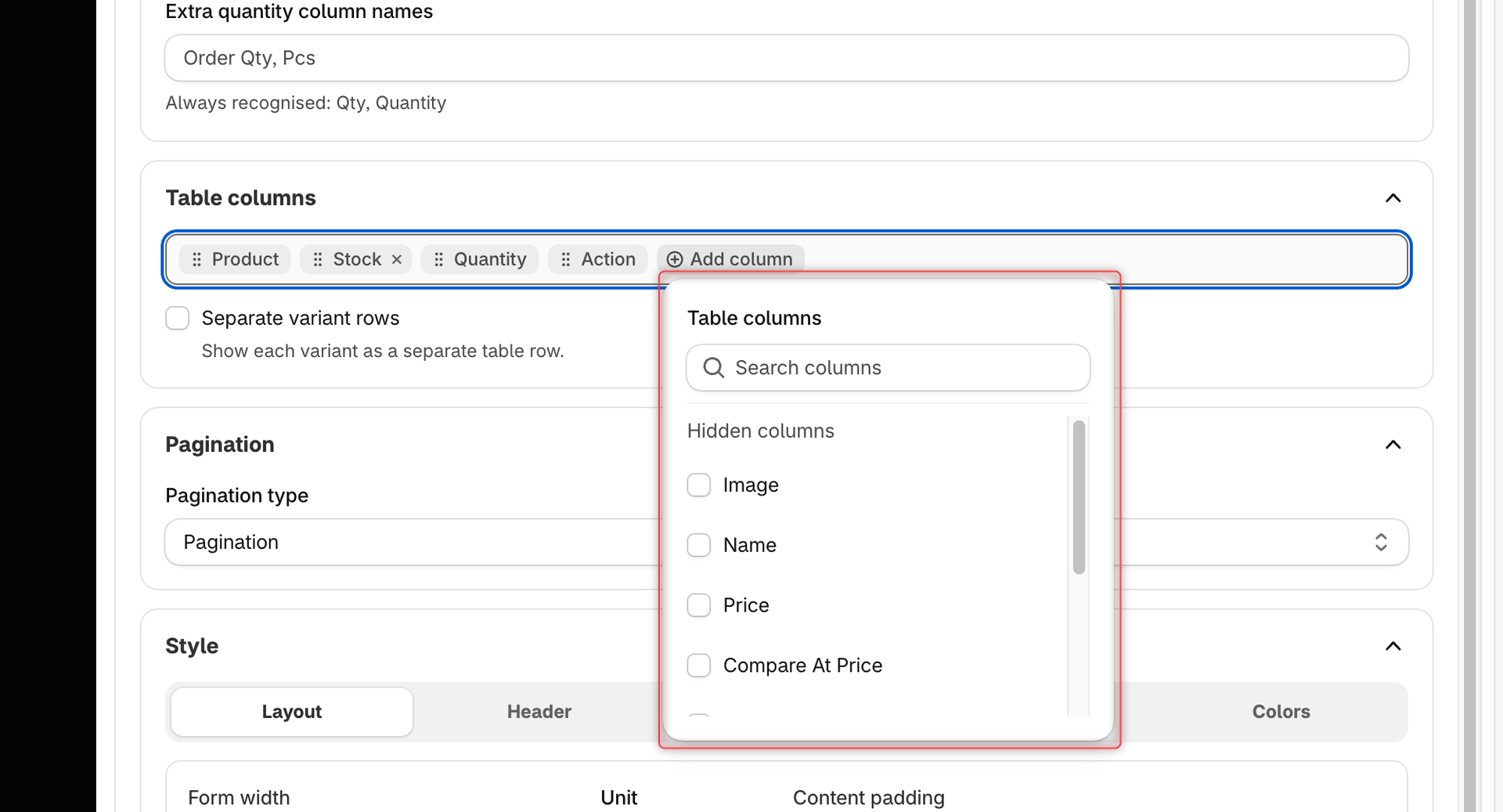
The chips at the top of this section are the table's columns, in the order buyers see them from left to right.

* Drag a chip to move its column.
* Click **×** on a chip to hide that column.
* Click **Add column** to show another column. In the **Table columns** popover, tick a column under **Hidden columns** to show it, or untick one under **Visible columns** to hide it. Use **Search columns** to find a column by name. A column you show appears at its default position, usually to the left of **Product**; drag its chip to move it.

| Column               | What it shows                                                                                                                                                                                                                                        | Shown by default   |
| -------------------- | ---------------------------------------------------------------------------------------------------------------------------------------------------------------------------------------------------------------------------------------------------- | ------------------ |
| **Product**          | The image, name, SKU and price together in one cell. Anything that has its own column is left out of this cell. On a product with several variants, the product row shows only the image and name, and each variant row shows its own SKU and price. | Yes                |
| **Stock**            | The stock badge of the product or variant, based on [Stock thresholds](/globo-b2b-bulk-order/settings/stock-status.md).                                                                                                                              | Yes                |
| **Quantity**         | The quantity box with − and + buttons.                                                                                                                                                                                                               | Yes (always shown) |
| **Action**           | The **Add** button, or the **Show variants** button on a product with several variants.                                                                                                                                                              | Yes (always shown) |
| **Image**            | The product or variant image.                                                                                                                                                                                                                        | No                 |
| **Name**             | The product name. Variant rows show the variant's options, for example **Teal** and **M**.                                                                                                                                                           | No                 |
| **Price**            | The price.                                                                                                                                                                                                                                           | No                 |
| **Compare At Price** | The compare-at price, struck through, when it's higher than the price.                                                                                                                                                                               | No                 |
| **Product SKU**      | The SKU.                                                                                                                                                                                                                                             | No                 |
| **Vendor**           | The vendor.                                                                                                                                                                                                                                          | No                 |
| **Type**             | The product type.                                                                                                                                                                                                                                    | No                 |

A few rules apply:

* **Quantity** and **Action** can't be hidden, so their chips have no **×**.
* **Product** can be hidden only while **Image**, **Name** and **Price** are all shown. If you hide one of those three, **Product** comes back automatically.
* If you show **Compare At Price**, show **Price** too. With either column on, the **Product** cell stops showing prices, and **Compare At Price** shows only the old, struck-through price.
* The column headers buyers see come from **Settings** > **Translations**, not from the chip names. In English they match by default.

Under the chips, the **Separate variant rows** checkbox (**Show each variant as a separate table row.**) changes how products with several variants appear. It's off by default.

| Separate variant rows | What buyers see                                                                                                                 |
| --------------------- | ------------------------------------------------------------------------------------------------------------------------------- |
| Off                   | One row per product with a **Show variants** button. Buyers click it to list that product's variants, 15 at a time.             |
| On                    | Every variant is its own row, named like **Classic Crew Tee - Teal / M**. Each variant row counts toward **Products per page**. |

<figure><img src="https://4205698016-files.gitbook.io/~/files/v0/b/gitbook-x-prod.appspot.com/o/spaces%2FcOPpR31lfLzPdPWnPtOU%2Fuploads%2Fgit-blob-28ff381f8b63439f3aae8530cc1b09b0d5630ccc%2Fscreenshot-quick-order-customize-table-columns.png?alt=media" alt="Table columns section with the Product, Stock, Quantity and Action chips and the Add column popover open, listing Image, Name, Price and the other hidden columns"><figcaption><p>Drag the chips to reorder columns, and use Add column to show or hide optional columns.</p></figcaption></figure>

## Pagination

| Setting               | Options                       | Default        | What buyers see                                                                                                                                                                                                                                                                           |
| --------------------- | ----------------------------- | -------------- | ----------------------------------------------------------------------------------------------------------------------------------------------------------------------------------------------------------------------------------------------------------------------------------------- |
| **Pagination type**   | **Pagination**, **Load more** | **Pagination** | **Pagination**: a range such as "1-10 of 12 products" and **‹** **Page 1 of 2** **›** arrows under the table, hidden when every row fits on one page. **Load more**: a **Load more** button that adds the next rows below the ones already shown, and disappears when every row is shown. |
| **Products per page** | 10, 20, 40, 50, 100           | 20             | How many rows show per page, or how many rows each **Load more** click adds.                                                                                                                                                                                                              |

The "Page 1 of 2" text is always in English. It isn't in Translations, so it can't be changed.

## Style

The **Style** section has five sub-tabs: **Layout**, **Header**, **Table**, **Button** and **Colors**. Number settings have a slider and a number box, from 0 up to the maximum listed below. All sizes are in px, except **Form width**, which can be in **%** or **px**. To change a color, click its swatch to open the color picker; to type a hex code instead, click the pencil icon next to the value in the picker. Style settings apply to this form only.

### Layout

| Setting                     | Options                                                   | Default | What it changes                                                                                                                                                                                                                                                                                                                     |
| --------------------------- | --------------------------------------------------------- | ------- | ----------------------------------------------------------------------------------------------------------------------------------------------------------------------------------------------------------------------------------------------------------------------------------------------------------------------------------- |
| **Form width** and **Unit** | **%** (up to 100) or **px** (number box only, no maximum) | 100 %   | The form's width. With **%**, the form shrinks with the screen and is never wider than 1180 px. With **px**, the form stays exactly that wide on every screen, so a large value can run off the edge on phones. The preview shrinks it to fit, but your storefront doesn't. Changing the unit converts the value (100 % = 1180 px). |
| **Content padding**         | 0–60 px                                                   | 20 px   | Space between the form's edge and its content. Currently this changes only the preview: on your storefront the form keeps its standard padding.                                                                                                                                                                                     |
| **Section gap**             | 0–60 px                                                   | 16 px   | Space between the heading, the search and sort bar, and the table.                                                                                                                                                                                                                                                                  |

### Header

| Setting                   | Options                         | Default  | What it changes                         |
| ------------------------- | ------------------------------- | -------- | --------------------------------------- |
| **Title font size**       | 0–48 px                         | 24 px    | Size of the **Title text**.             |
| **Description font size** | 0–24 px                         | 14 px    | Size of the **Description**.            |
| **Header align**          | **Left**, **Center**, **Right** | **Left** | Alignment of the title and description. |

### Table

The first four settings are in the **Table** group, the last three in the **Border** group.

| Setting              | Options                                    | Default         | What it changes                                                   |
| -------------------- | ------------------------------------------ | --------------- | ----------------------------------------------------------------- |
| **Header font size** | 0–24 px                                    | 13 px           | Size of the column headers.                                       |
| **Row font size**    | 0–24 px                                    | 14 px           | Size of the text in the rows.                                     |
| **Row padding**      | **Compact**, **Comfortable**, **Spacious** | **Comfortable** | Space inside each cell.                                           |
| **Image size**       | 0–120 px                                   | 42 px           | Width and height of the product images.                           |
| **Size**             | 0–10 px                                    | 1 px            | Thickness of the table's outer border and the lines between rows. |
| **Radius**           | 0–20 px                                    | 10 px           | Roundness of the table's corners.                                 |
| **Style**            | **Solid**, **Dashed**, **Dotted**          | **Solid**       | Line style of the borders.                                        |

### Button

These settings apply to every button in the form: **Add**, **Show variants**, **Clear**, **Bulk order**, **Load more**, **View cart** and **Checkout**. Button colors are on the **Colors** sub-tab.

| Setting          | Options                           | Default     | What it changes                                                |
| ---------------- | --------------------------------- | ----------- | -------------------------------------------------------------- |
| **Button size**  | **Small**, **Medium**, **Large**  | **Large**   | Padding around the button text.                                |
| **Button shape** | **Square**, **Rounded**, **Pill** | **Rounded** | Roundness of the button corners.                               |
| **Font size**    | 0–24 px                           | 13 px       | Size of the button text.                                       |
| **Width**        | **Auto**, **Full**                | **Auto**    | **Full** stretches each button to the full width of its space. |

### Colors

The **Button** group has four tabs, **Primary**, **Secondary**, **Checkout** and **Quantity**, and each tab has the same four colors: **Background**, **Text**, **Border** and **Hover background**.

| Group                      | Colors                                                                                                                                                   | Defaults                                                         | What they color                                                                                                         |
| -------------------------- | -------------------------------------------------------------------------------------------------------------------------------------------------------- | ---------------------------------------------------------------- | ----------------------------------------------------------------------------------------------------------------------- |
| **Header**                 | **Title color**, **Description color**                                                                                                                   | `#000000`, `#616161`                                             | The title and the description.                                                                                          |
| **Table**                  | **Header background**, **Row background**, **Header text**, **Row text**, **Border color**, **Price color**                                              | `#ffffff`, `#ffffff`, `#000000`, `#212121`, `#d9d9d9`, `#8b2e3f` | The column header row, the rows, the borders and the current price.                                                     |
| **Button** > **Primary**   | **Background**, **Text**, **Border**, **Hover background**                                                                                               | `#ffffff`, `#111111`, `#111111`, `#111111`                       | The row **Add** button. The hover background also fills the button once the item is in the cart and it reads **Added**. |
| **Button** > **Secondary** | **Background**, **Text**, **Border**, **Hover background**                                                                                               | `#ffffff`, `#111111`, `#111111`, `#111111`                       | The **Show variants**, **Bulk order**, **Clear** and **View cart** buttons.                                             |
| **Button** > **Checkout**  | **Background**, **Text**, **Border**, **Hover background**                                                                                               | `#111111`, `#ffffff`, `#111111`, `#000000`                       | The **Checkout** button in the footer bar.                                                                              |
| **Button** > **Quantity**  | **Background**, **Text**, **Border**, **Hover background**                                                                                               | `#fafafa`, `#111111`, transparent, `#111111`                     | The quantity box and its − and + buttons.                                                                               |
| **Subtotal badge**         | **Subtotal badge background**, **Subtotal badge text**                                                                                                   | `#ecfdf3`, `#007e60`                                             | The "0 item(s) selected" badge in the footer bar.                                                                       |
| **Pagination**             | **Pagination background**, **Pagination text**, **Pagination border**, **Pagination hover background**, **Active page background**, **Active page text** | `#ffffff`, `#6b6b6b`, `#e2e2e2`, `#f5f5f7`, `#111111`, `#ffffff` | The page arrows and the range text. The two active page colors style the "Page 1 of 2" pill.                            |

When **Pagination type** is **Load more**, the two active page colors are hidden and the group reads **With "Load more" selected, these colors style the Load more button instead of page arrows.**

<figure><img src="https://4205698016-files.gitbook.io/~/files/v0/b/gitbook-x-prod.appspot.com/o/spaces%2FcOPpR31lfLzPdPWnPtOU%2Fuploads%2Fgit-blob-85d79598aa03371a291c3b9c3667fbe1e137f935%2Fscreenshot-quick-order-customize-style-colors.png?alt=media" alt="Style section on the Colors sub-tab, with the Button group&#x27;s Primary, Secondary, Checkout and Quantity tabs and the Primary button&#x27;s four color fields"><figcaption><p>Button colors are set per button type in the Button group of the Colors sub-tab.</p></figcaption></figure>

## Custom CSS

Use **Custom CSS** for any change the **Style** settings don't cover.

{% stepper %}
{% step %}

### Open the section

Click **Custom CSS** to open the section. It starts collapsed and shows an empty box with the placeholder **Enter your custom CSS here**.
{% endstep %}

{% step %}

### Pick a class

Under **Available CSS classes**, click a class, for example `.saBO-btn-checkout` (**Footer checkout button**). An empty rule for that class is added to the box.
{% endstep %}

{% step %}

### Type your styles

Type your styles inside the rule, for example:

```css
.saBO-btn-checkout {
  text-transform: uppercase;
}
```

{% endstep %}
{% endstepper %}

The preview shows your CSS right away, and the storefront after you save. For the full class list and more examples, see [Design & custom CSS](/globo-b2b-bulk-order/targeting-and-design/design-and-custom-css.md).

{% hint style="warning" %}
Custom CSS isn't limited to this form. It's added to the page exactly as written, so a rule for `.saBO-card` also changes any other Quick Order form on the same page.
{% endhint %}

## Change button and label text

The **Header** section is the only place to set text for a single form. All other wording in the form is shared by every Quick Order form and is set per language in **Settings** > **Translations**, in the **Quick Order Form Table** section. This includes:

* the **Order table** heading and the column headers
* the **Add**, **Added**, **Show variants**, **Hide variants**, **Clear** and **Bulk order** buttons
* the search placeholder and the sort menu labels, such as **Sort: Recommended**
* **Load more**, and the footer bar's "0 item(s) selected", **Total**, **View cart** and **Checkout**

The stock badge wording is in the **Stock** section of the same editor, while the stock levels and their colors are in [Stock thresholds](/globo-b2b-bulk-order/settings/stock-status.md).

To change a text, go to **Settings** > **Translations**, click the pencil icon (**Translate**) in the row of the language, and choose **Quick Order Form Table** under **Storefront sections**. You can also type the current text, for example `View cart`, in **Search strings** to find it. See [Edit translations](/globo-b2b-bulk-order/settings/edit-translations.md) for the full steps.

## Save and check your storefront

{% stepper %}
{% step %}

### Save your changes

Click **Save** in the save bar at the top of the screen. A **Form updated** message confirms the save. To undo every change since your last save, click **Discard** instead, then **Discard** again in the **Unsaved** dialog.

If a **Fix errors to save** banner appears, correct the fields it lists and click **Save** again.
{% endstep %}

{% step %}

### Reload the page with the form

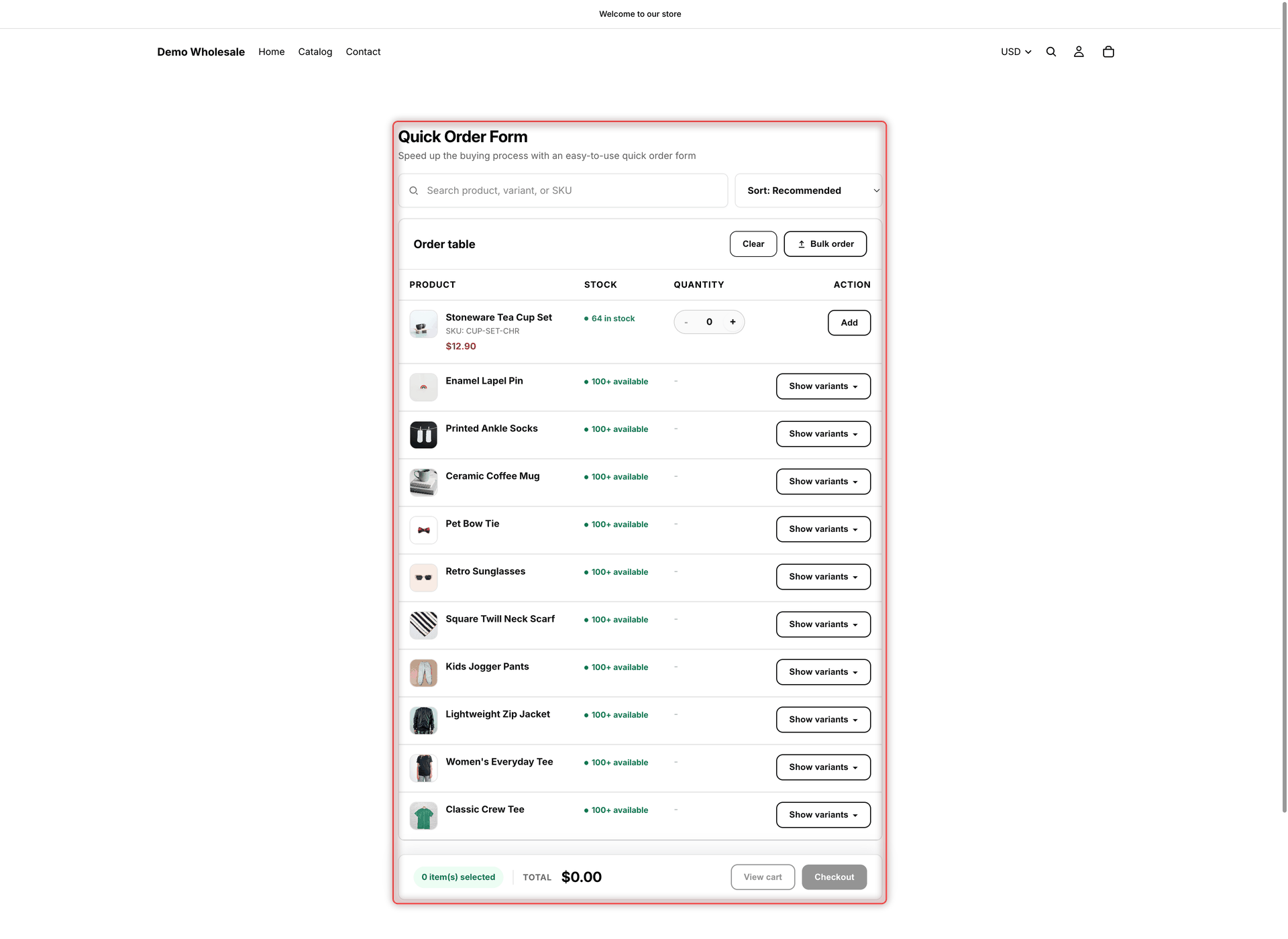
Open the storefront page where you placed the form, or reload it if it's already open. Your new heading, columns, pagination and style show. Changes can take a few moments to reach the storefront, so if you don't see them yet, wait a moment and reload again.

If you haven't placed the form yet, copy its code from **Visibility** > **Publishing** > **Copy** and add it to a page with the **GloboBO quick order form** app block. See [Add the form to a page](/globo-b2b-bulk-order/getting-started/getting-started.md#add-the-form-to-a-page).
{% endstep %}

{% step %}

### Test what the preview can't

Search for a product, pick a sort option, page through the table and add an item to the cart. Then check the page on a phone: on narrow screens the table turns into stacked cards, each value is labeled with its column header, and the buttons stretch to full width.
{% endstep %}
{% endstepper %}

<figure><img src="https://4205698016-files.gitbook.io/~/files/v0/b/gitbook-x-prod.appspot.com/o/spaces%2FcOPpR31lfLzPdPWnPtOU%2Fuploads%2Fgit-blob-fcdfe8fe4367e2b27535879f5573297147f30001%2Fscreenshot-storefront-quick-order-form.png?alt=media" alt="A Quick Order form on a storefront page, with a search box, a sort menu, Clear and Bulk order buttons, product rows with Show variants buttons, one product row with a quantity box and an Add button, and a footer with Total, View cart and Checkout"><figcaption><p>After you save, reload the storefront page to see the customized form.</p></figcaption></figure>

{% hint style="warning" %}
If the form doesn't appear or still looks the same, check that it's **Active**, that the **Globo Bulk Order** app embed is on, that the page is allowed under **Display location** on the **Visibility** tab, and that you're browsing as a customer who matches **Who can see this form?**. See [Troubleshooting](/globo-b2b-bulk-order/help/troubleshooting.md).
{% endhint %}

## Next steps

* [Choose who sees the form and where](/globo-b2b-bulk-order/quick-order-form/visibility.md)
* [Let buyers upload an order file](/globo-b2b-bulk-order/quick-order-form/upload-an-order-file.md)
* [Design & custom CSS](/globo-b2b-bulk-order/targeting-and-design/design-and-custom-css.md)
* [Edit translations](/globo-b2b-bulk-order/settings/edit-translations.md)