> For the complete documentation index, see [llms.txt](https://docs.globo.io/llms.txt). Markdown versions of documentation pages are available by appending `.md` to page URLs; this page is available as [Markdown](https://docs.globo.io/globo-combined-listings/getting-started/quickstart.md).

# Quickstart: your first combined listing

This walkthrough creates the simplest kind of group — products that vary by one option, like Color — and publishes it to your storefront.

## Before you start

* Install the app and [turn on the app embed](/globo-combined-listings/getting-started/enable-the-app.md).
* Have at least two products that are variations of each other (e.g. *Summer Tee — Red* and *Summer Tee — Blue*).

## Create the group

{% stepper %}
{% step %}

### Start a new group

Go to **Groups → Create group** and choose **Group by single option**.

<figure><img src="/files/AtxSxIaoI6a4fdqsjptZ" alt="Create group dialog showing four group type cards to choose from"><figcaption><p>Choose Group by single option to start your first group.</p></figcaption></figure>
{% endstep %}

{% step %}

### Pick the products to link

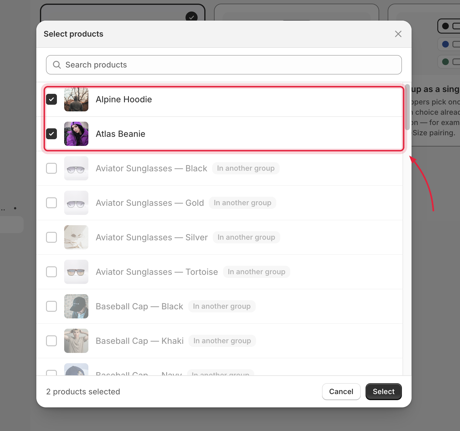
The product picker opens first. Search, then select each variation. Products already in another group appear disabled — a product can only belong to one group.

<figure><img src="/files/fcgppPUkcNPrYPuHns1D" alt="Product picker with two products selected"><figcaption><p>Pick the products you want to link together.</p></figcaption></figure>
{% endstep %}

{% step %}

### Name the option and its values

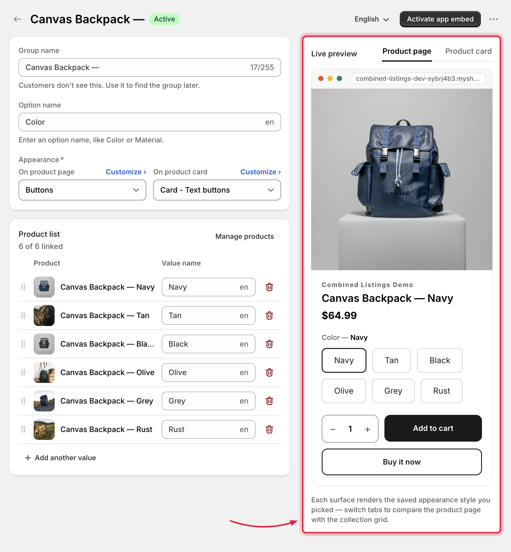
Set the option name (e.g. `Color`) and one value per product (e.g. `Red`, `Blue`). Each value gets a swatch: **First image**, **One color**, **Two colors**, or **Custom image**.

<figure><img src="/files/iJNNvGhjSZs1Mk1cQZhQ" alt="Group editor showing the option card and a product row for each linked product"><figcaption><p>Each product gets its own value — the swatch preview updates live.</p></figcaption></figure>
{% endstep %}

{% step %}

### Check the live preview

The right-hand preview shows exactly how the widget will look, with **Product page** and **Product card** tabs. The default style works out of the box — if you'd like a different look, pick one of the ready-made styles (see [Styles](/globo-combined-listings/styles/styles.md)).
{% endstep %}

{% step %}

### Publish

Click **Publish group**. The group is created with status **Active** and syncs to your storefront.

{% hint style="info" %}
Storefront updates are processed in the background and cached by Shopify's CDN — allow a minute or two for changes to appear.
{% endhint %}
{% endstep %}

{% step %}

### Preview on your storefront

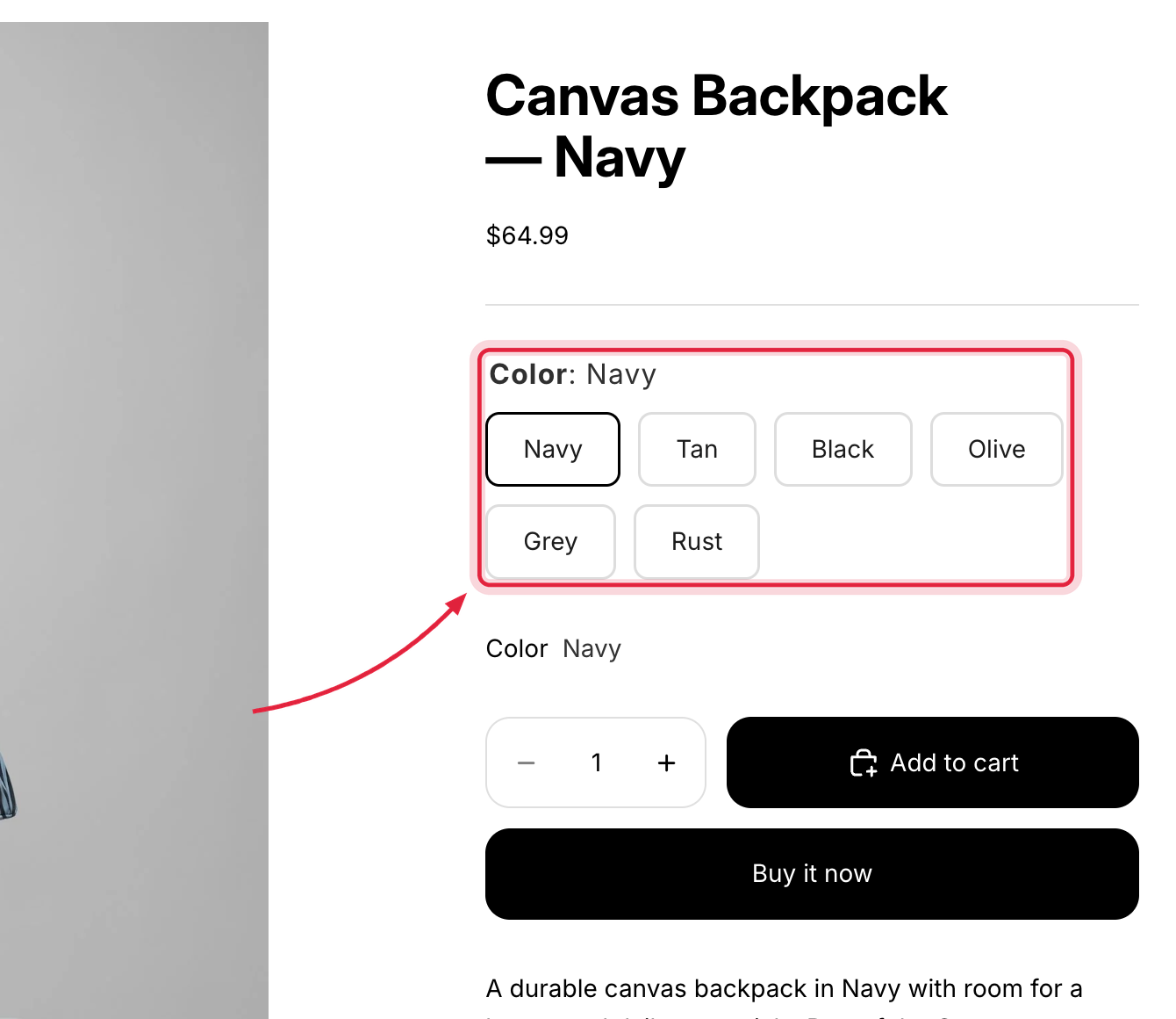
Open one of the linked products on your store. The option widget appears on the product page and on collection cards.

<figure><img src="/files/ipI0qJIzdtKRhQScO0U5" alt="Storefront product page with the new swatch widget"><figcaption><p>Your new group live on the storefront, ready for customers.</p></figcaption></figure>
{% endstep %}
{% endstepper %}

## Next steps

* Have many products following a naming pattern? [Group by title pattern](/globo-combined-listings/product-groups/group-by-title-pattern.md) creates groups in bulk.
* Products varying by more than one option? See [Group types](/globo-combined-listings/product-groups/group-types.md).
* Want a different look? Pick a ready-made style from the [Style library](/globo-combined-listings/styles/style-library.md) — and [customize it](/globo-combined-listings/styles/customize-a-style.md) only if you need finer control.