For the complete documentation index, see llms.txt. This page is also available as Markdown.

Create a multiple-options group

Step-by-step: build a multiple-options group where two or more things — like Color and Size — combine, group name to publish.

Use this when two or more things change — like Color and Size — and you have one product per combination. Shoppers pick each option separately, one at a time — Color, then Size. Not sure this is the right type? See Group types.

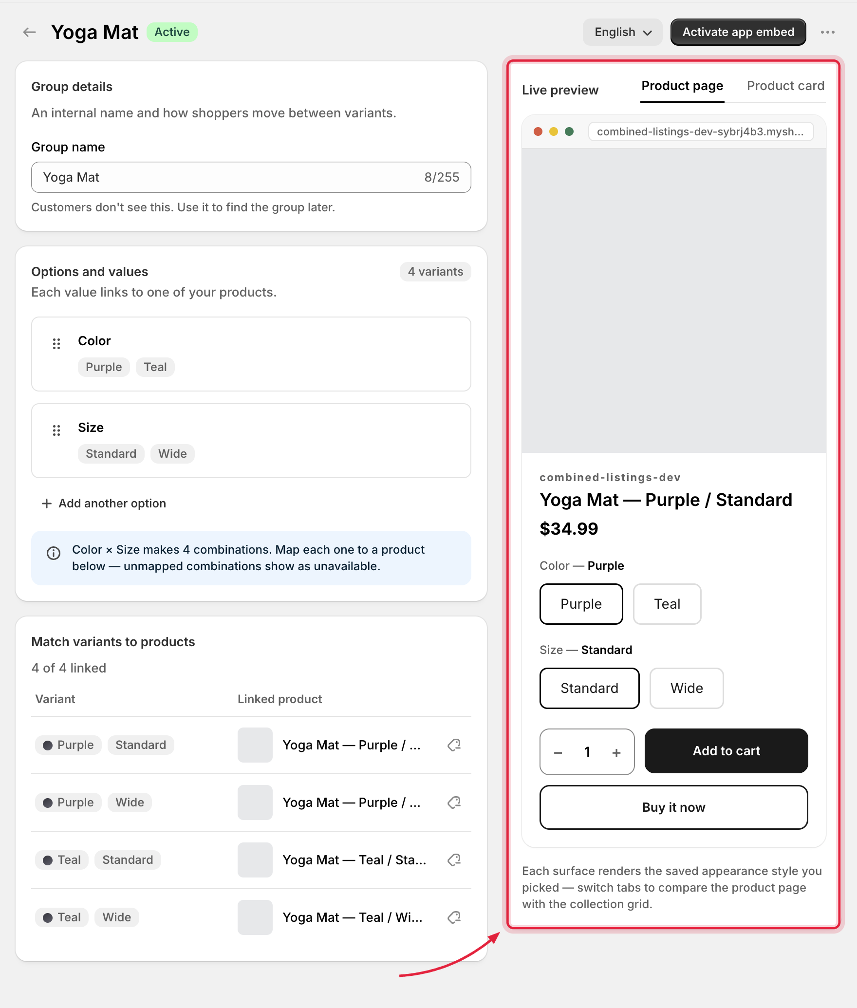
Multiple-options group editor with the live preview panel on the right
The multiple-options group editor, with a live storefront preview alongside.
Group details

The internal Group name (up to 255 characters) — used only inside the admin; customers don't see this. The field shows placeholder text like Hoka Tecton X 3 — Women's until you type your own.

Options and values

Add each option that changes (e.g. Color, Size) with its own values. The editor combines your options into every possible pairing (Black + M, Black + L, …).

"Each value links to one of your products."

  • Option name — the label shoppers see (e.g. Color). Rename per language via the storefront language switcher.

  • Values — add, rename, and drag to reorder. Each value has a swatch that represents it visually:

Swatch type
What shows

First image

The linked product's first image.

One color

A solid color you pick.

Two colors

A split two-color swatch (e.g. for dual-tone products).

Custom image

An image you upload.

📸 Screenshot placeholder — a value row with the swatch type dropdown open.

Appearance

Each option chooses a style per surface — On product page and On product card — from your style library, or Hidden to skip that surface. New options come prefilled with your default styles, so picking a ready-made style that fits is usually all you need — Customize jumps into the style editor when you want finer control.

Linking products

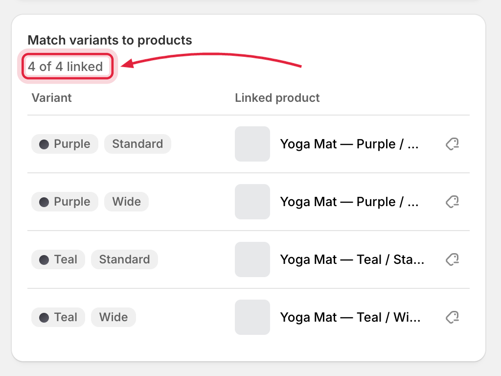
The Match variants to products section lists every combination with a link/unlink action and a X of Y linked counter. Connect each combination to the product that represents it.

Match variants to products section with one variant combination unlinked
Every option combination needs a linked product — unlinked rows are flagged here.
The product picker searches your catalog with infinite scroll, and disables archived products and products already in another group. Unlinked combinations make the group incomplete.

Live preview

A sticky preview pane renders your actual widget with tabs for Product page and Product card. It updates as you type and reflects the selected styles — what you see is what ships.

Saving and publishing

  • Publish group (create) / Save group (edit) — the primary action.

  • More actions menu: Set as active, Set as draft, Delete.

  • A save bar guards unsaved changes when you navigate away.

Validation errors

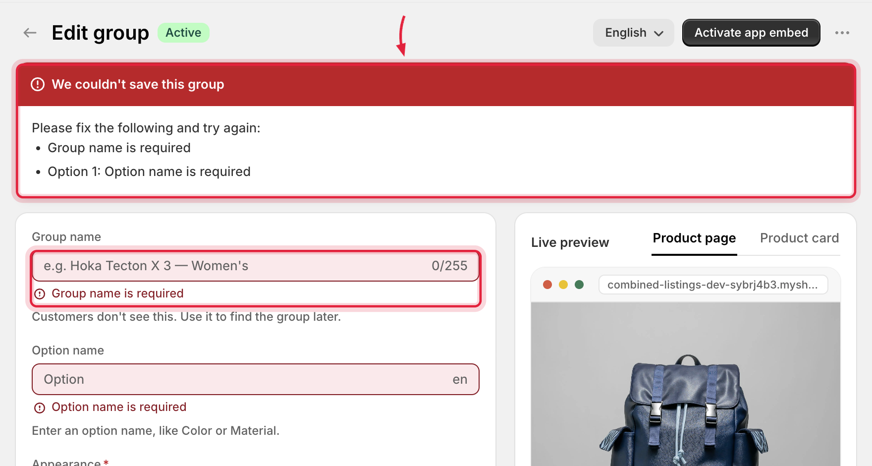
If something is invalid (missing option name, duplicate value names, a product already taken…), the editor shows a critical banner at the top plus inline field errors, and scrolls to the first problem. Fix and save again.

Group editor validation banner with an inline field error
The same validation banner and inline errors appear for multiple-options groups.

After saving, storefront data syncs in the background — allow a minute or two before checking your live store.

Next

Last updated

Was this helpful?