> For the complete documentation index, see [llms.txt](https://docs.globo.io/llms.txt). Markdown versions of documentation pages are available by appending `.md` to page URLs; this page is available as [Markdown](https://docs.globo.io/globo-combined-listings/styles/customize-a-style.md).
# Customize a style
Every control in the style editor: shape, overflow, states, hover animation, tooltips, prices, sold-out effects, and color schemes.
Customizing is **optional** — every ready-made style ships storefront-ready. Come here when you want a style to match your brand more closely than the presets allow.
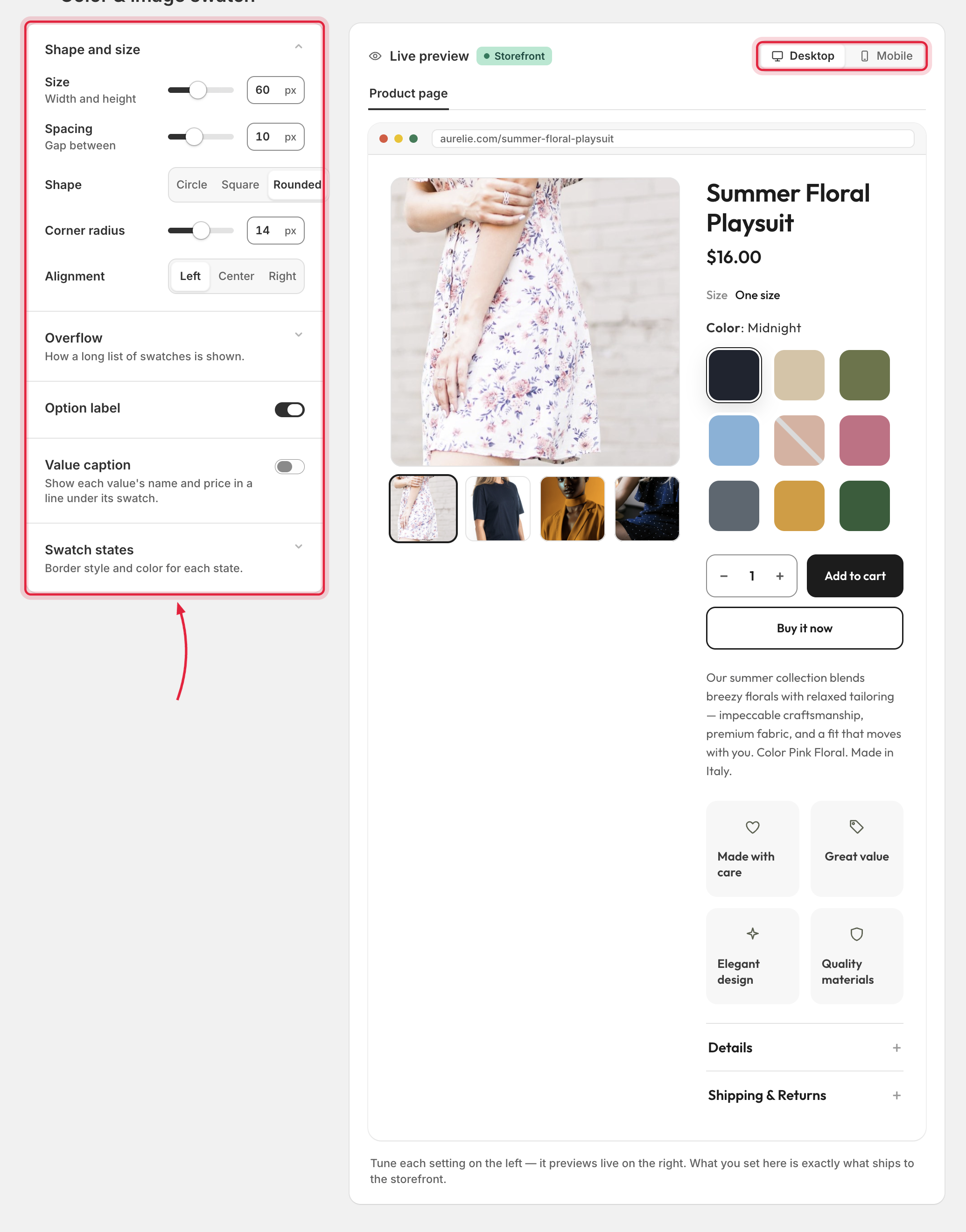
Open a style from **Styles → Customize** (or via **Customize** on an option in the group editor). Controls sit on the left; a live preview on the right renders the real storefront widget with **Desktop / Mobile** and **Product page / Card** toggles.
Adjust controls on the left and watch the live preview update on the right.
{% hint style="info" %}
What you set here is exactly what ships to the storefront — the preview uses the same rendering engine as your theme widget.
{% endhint %}
## Common control groups
Available groups vary by template; these apply to most:
### Shape and size
Size, spacing, shape (**Circle / Square / Rounded / Pill**), corner radius, border width, inner padding, and alignment.
### Overflow
What happens when values don't fit on one line:
| Mode | Behavior |
| -------------------- | ----------------------------------------------------------------------------------------------- |
| **Wrap to rows** | Values flow onto extra rows. |
| **Show-more button** | Show the first *N* values plus a "+3 more" toggle (text editable). |
| **Slider** | A horizontal slider with configurable arrows (shape, size) and edge behavior (**Snap / Peek**). |
### Swatch states
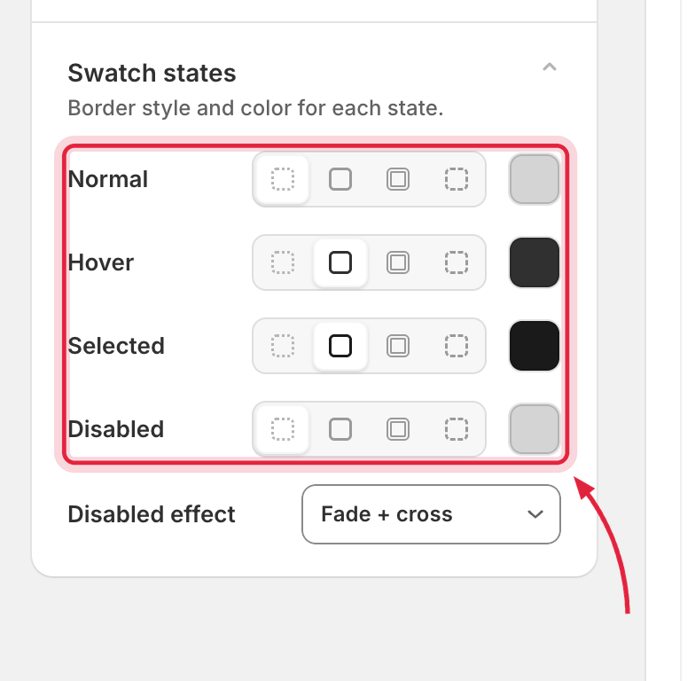
A 4-state matrix — **Normal, Hover, Selected, Disabled** — each with its own border style (**None / Single / Double / Dashed**) and border color.
Every state, previewed together — Normal, Hover, Selected, and Disabled.
### Hover animation
**None, Scale up, Scale up (gentle), Scale down, Float up, Float down, Rotate left, Rotate right, Zoom image.**
### Hover tooltip
Show the value name in a bubble on hover; background and text colors are configurable.
### Option label and value caption
Show or hide the option label (`Color: Red`), the selected value's name, and optionally the linked product's **price** — with fonts, sizes, and colors.
### Sold-out effect
How unavailable values look: **Fade + cross, Fade only, Cross only, Strike-through, Fade + strike, Grayscale, Veil, None.** (Screen readers always get a "— Sold out" label regardless of the visual.)
### Color schemes
One-click recolor presets — **Light, Dark, Soft, Bold, Ocean, Forest, Sand, Berry** — or **Custom** for full manual control.
## Template-specific groups
Each template adds its own sections, for example:
* **Tab** — layout (underline vs segmented), text, underline and rule.
* **Dropdown** — trigger, panel and rows, row media (text / dot / thumbnail), selected row.
* **Chip** — dot and name, surface (solid / frosted glass), selected check.
* **Tile** — tile fill, name and check badge, variant image.
* **Cards** — thumbnail, name / meta / price rows.
## Texts and translations
Editable widget texts (like the show-more label) can be translated per storefront language via the **Storefront language** switcher — see [Translations](/globo-combined-listings/product-groups/translations.md).
## Saving
**Save** applies the style to every group using it (a background sync updates the storefront). **Reset to default** restores the template's original settings; the save bar guards unsaved changes.