> For the complete documentation index, see [llms.txt](https://docs.globo.io/llms.txt). Markdown versions of documentation pages are available by appending `.md` to page URLs; this page is available as [Markdown](https://docs.globo.io/globo-combined-listings/styles/style-library.md).
# Style library
The 9 widget templates and the ready-made preset catalog, per surface.
Every style is built on one of **9 templates**. Presets in the *Explore* gallery are pre-configured looks — add one and it becomes an editable style of your own.
## Templates
Every template is a starting point you can customize.
| Template | Kind | Look |
| --------------------- | -------- | ------------------------------------------------------------------------------------ |
| **Swatch** | swatch | Round/square color or image chips with hover tooltip. The classic color swatch. |
| **Button** | button | Boxed or borderless text buttons. |
| **Button with price** | button | Two-row buttons showing the value name and the linked product's price. |
| **Chip** | chip | Pill chips — solid or frosted-glass — with a leading color dot and a selected check. |
| **Tab** | tab | Underline tabs or an iOS-style segmented control. |
| **Tile** | tile | Image tiles with a name overlay and a check badge when selected. |
| **Dropdown** | dropdown | A select menu; rows can show text, a color dot, or a thumbnail. |
| **Card** | card | A vertical stack of selectable radio cards. |
| **Card with image** | card | Variant-image tiles with name and price. |
### Surface availability
All templates are available on the **Product page** surface. The **Collection page** surface ships presets for the compact templates: swatch, chip, tile, dropdown, and button. (Cards render in tighter space, so the large card/tab templates are product-page oriented.)
## Presets ("Explore more styles")
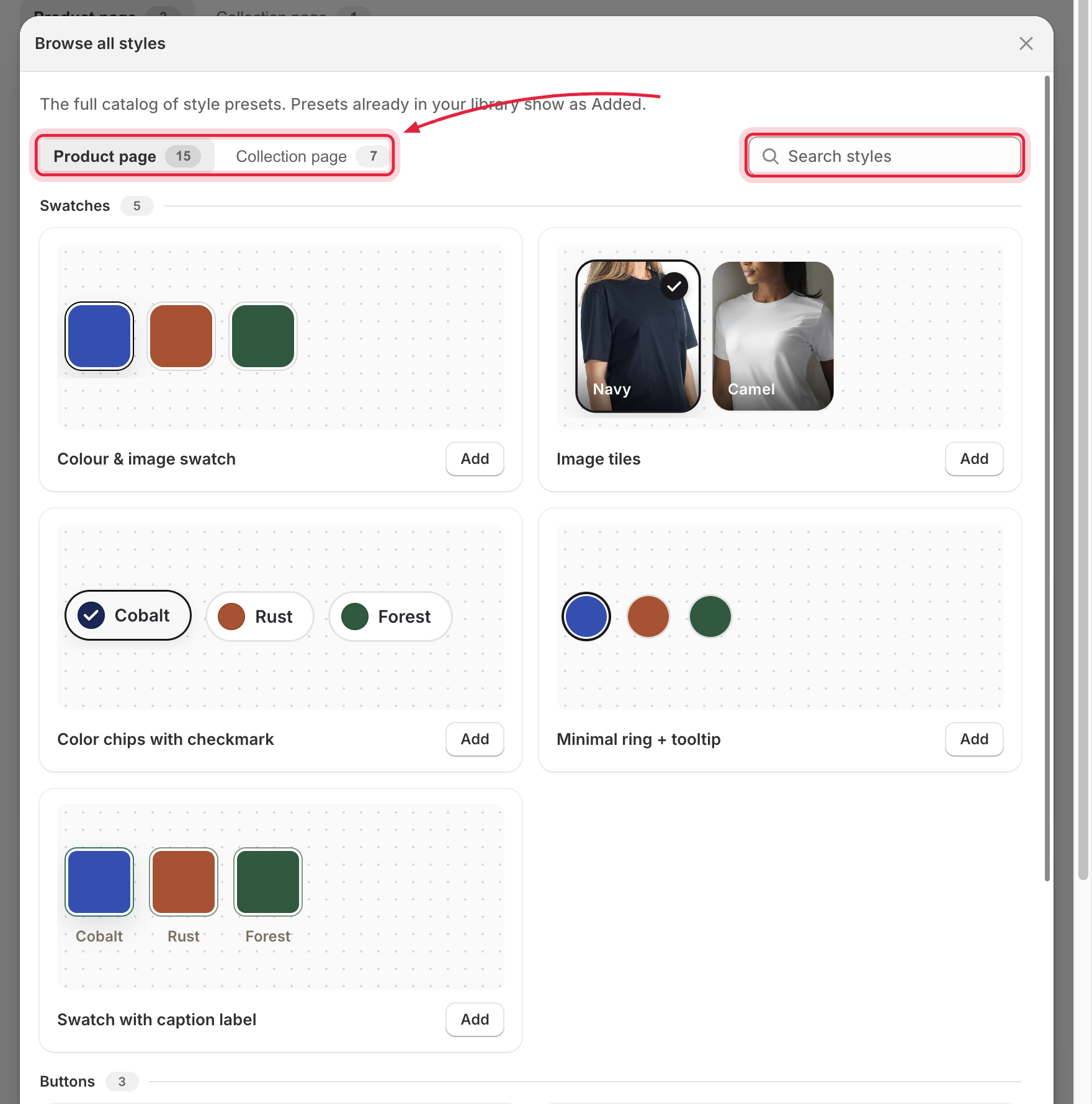
The gallery is filterable by kind — **Swatches, Buttons, Cards, Tabs, Dropdowns** — and split by surface tab. Examples of shipped presets:
* *Product page:* Color & image swatch, Button, Button without border, Button with price, Dropdown, Underline tabs, Image tiles, Selectable option cards, Color chips with checkmark, Minimal ring + tooltip, segmented and underline tab variants…
* *Collection page:* Mini swatch, Chip with dot, Mini tile, Square swatch, Compact dropdown, Text button…
Filter by surface and search to find the right template fast.
Click **Add** on a preset to copy it into **Your styles**, then [customize it](/globo-combined-listings/styles/customize-a-style.md) freely — presets are starting points, not locked designs.
## Managing your styles
* **Customize** — opens the [style editor](/globo-combined-listings/styles/customize-a-style.md).
* **Rename / Duplicate / Delete** — from the card's menu. Duplicating is the safe way to experiment with a style that's already **In use**.
{% hint style="info" %}
A style marked **In use** is referenced by at least one group, so it can't be deleted. Edits to it apply to all of those groups on your storefront instead.
{% endhint %}