> For the complete documentation index, see [llms.txt](https://docs.globo.io/llms.txt). Markdown versions of documentation pages are available by appending `.md` to page URLs; this page is available as [Markdown](https://docs.globo.io/globo-mega-menu/adjust-menu-styling/adjust-menu-colors.md).
# Adjust Menu Colors
Set the colors of the main menu, submenus, tabs, labels and buttons.
The **Colors** tab sets the colors of the whole menu: the menu bar, submenus, tabs, product labels and the add-to-cart button. Use it to match the menu to your brand. These colors apply to every item; to color one item differently, see the tip at the end of this page.
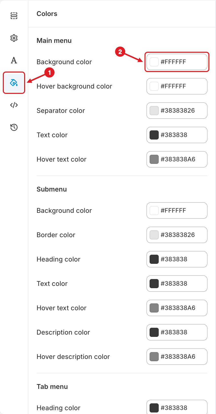
Open the Colors tab (1), then click a color field (2)
## Change a Color
{% stepper %}
{% step %}
### Open the Colors tab
In the menu editor, click the paint bucket icon (🎨) in the left sidebar (1). The **Colors** panel opens.
{% endstep %}
{% step %}
### Click a color field
Click the field next to the color you want to change (2). Pick a color in the picker, or type a hex code such as `#FFFFFF`.
{% endstep %}
{% step %}
### Check the preview
The preview updates right away. Hover over items in the preview to check hover colors.
{% endstep %}
{% step %}
### Save and publish
Click **Save**, then **Publish**.
{% endstep %}
{% endstepper %}
{% hint style="info" %}
Colors can include transparency. An 8-digit hex code such as `#383838A6` is the color `#383838` with some transparency (the last two digits). `#FFFFFF00` is fully transparent.
{% endhint %}
## 🎨 All Color Settings
**Main menu** — the top-level menu bar
| Setting | What it colors |
| -------------------------- | ----------------------------------------------------------------------------------------------------------------------------------------------------------------- |
| **Background color** | The background of the menu bar |
| **Hover background color** | The background of a top-level item when it's hovered or its submenu is open |
| **Separator color** | The divider lines between items (shown when **Show divider on desktop / mobile** is on in [Menu Settings](/globo-mega-menu/adjust-menu-styling/menu-settings.md)) |
| **Text color** | Top-level item text and icons |
| **Hover text color** | Top-level item text and icons on hover |
**Submenu** — dropdowns, mega menus and their content
| Setting | What it colors |
| --------------------------- | ------------------------------------------------------------------------------------------------------------------------------- |
| **Background color** | The submenu background |
| **Border color** | The submenu border (shown when **Show border** is on in [Menu Settings](/globo-mega-menu/adjust-menu-styling/menu-settings.md)) |
| **Heading color** | Headings inside submenus, e.g. link list titles |
| **Text color** | Links and text inside submenus |
| **Hover text color** | Submenu links on hover |
| **Description color** | Description text under items |
| **Hover description color** | Description text on hover |
**Tab menu** — tabbed submenus
| Setting | What it colors |
| --------------------------- | ---------------------------------- |
| **Heading color** | Tab names |
| **Active heading color** | The name of the selected tab |
| **Active background color** | The background of the selected tab |
**Label** — labels on products shown in the menu
| Setting | What it colors |
| ------------------------------------------------------- | ------------------------------------- |
| **Sale text color** / **Sale background color** | The sale label on discounted products |
| **Sold out text color** / **Sold out background color** | The sold-out label |
**Add to cart button** — shown on products when **Show add to cart button** is on in [Menu Settings](/globo-mega-menu/adjust-menu-styling/menu-settings.md) > **Advanced**
| Setting | What it colors |
| ------------------------------------------------- | ------------------------------------------ |
| **Text color** / **Hover text color** | The button text, normal and on hover |
| **Background color** / **Hover background color** | The button background, normal and on hover |
{% hint style="warning" %}
**Text hard to read?** Make sure **Text color** contrasts well with **Background color**, and **Hover text color** with **Hover background color**. A white hover text on a white hover background makes items disappear on hover.
{% endhint %}
{% hint style="success" %}
To color a single item differently (for example a red "Sale" item), use the item's **Color** settings (**Pro Navigation**). See [Edit Menu Item](/globo-mega-menu/manage-menu-items/modify-main-menu-item.md).
{% endhint %}
***
### Related Articles
{% content-ref url="/pages/QE8B60KCTUmW2hXn75BF" %}
[Adjust Menu Font](/globo-mega-menu/adjust-menu-styling/adjust-menu-font.md)
{% endcontent-ref %}
{% content-ref url="/pages/CJqRGoOfDUa2UWF1CrbS" %}
[Menu Settings](/globo-mega-menu/adjust-menu-styling/menu-settings.md)
{% endcontent-ref %}
{% content-ref url="/pages/BtejsCo8DyYok4eGTxPy" %}
[Custom CSS](/globo-mega-menu/adjust-menu-styling/custom-css.md)
{% endcontent-ref %}
***
**💬 Need help?**
Email us at **📧** [**contact@globo.io**](mailto:contact@globo.io) - we’re happy to assist!