> For the complete documentation index, see [llms.txt](https://docs.globo.io/llms.txt). Markdown versions of documentation pages are available by appending `.md` to page URLs; this page is available as [Markdown](https://docs.globo.io/globo-mega-menu/adjust-menu-styling/menu-settings.md).
# Menu Settings
Settings that apply to the whole menu — layout, elements, animation and more.
The **Settings** tab controls how the whole menu looks and behaves: where it appears, its layout, which extra elements it shows, how submenus open, spacing, carousels and a few performance options. These settings apply to **every item** in the menu you're editing. To style a single item, use the item's own settings instead (see [Edit Menu Item](/globo-mega-menu/manage-menu-items/modify-main-menu-item.md)).
## Open the Settings Tab
{% stepper %}
{% step %}
### Open the menu editor
In the app, go to **Menu manager** and open the menu you want to change.
{% endstep %}
{% step %}
### Click the Settings tab
In the editor's left sidebar, click the gear icon (⚙️). The **Settings** panel opens. Scroll down to reach each section below.
{% endstep %}
{% step %}
### Save and publish
After changing settings, click **Save**, then **Publish** so the changes appear on your storefront. The preview in the editor updates as you edit.
{% endstep %}
{% endstepper %}
## 📍 Position
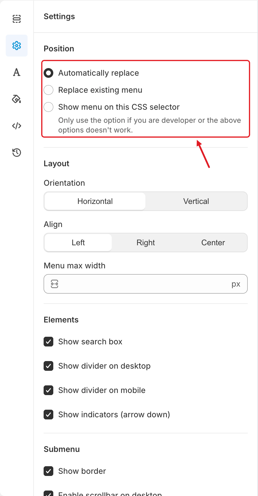
Choose how the menu is placed on your theme:
* **Automatically replace** — the app finds your theme's main menu and replaces it.
* **Replace existing menu** — you pick which theme menu to replace.
* **Show menu on this CSS selector** — you enter the CSS selector of the area where the menu should appear. Use it only if you're a developer or the options above don't work.
Each option is explained step by step in [Publish New Menu to Theme](/globo-mega-menu/basic-knowledge/publish-new-menu-to-theme.md).
## 📐 Layout and Elements
Position, Layout and Elements
| Setting | What it does |
| -------------------------------- | --------------------------------------------------------------------------------------------------------------------- |
| **Orientation** | **Horizontal** shows the top-level items in a row. **Vertical** stacks them in a column, like a sidebar menu. |
| **Align** | Aligns the top-level items **Left**, **Right** or **Center** inside the menu bar. |
| **Menu max width** | Maximum width of the menu in px, e.g. `1200`. Leave it empty to use the full width available. |
| **Show search box** | Adds a product search field to the menu. |
| **Show divider on desktop** | Shows a separator line between top-level items on desktop. The line color is set in **Colors** > **Separator color**. |
| **Show divider on mobile** | Shows separator lines between items in the mobile menu. |
| **Show indicators (arrow down)** | Shows a small arrow next to items that have a submenu, so shoppers know there is more to open. |
## 🗂️ Submenu and Menu Animation
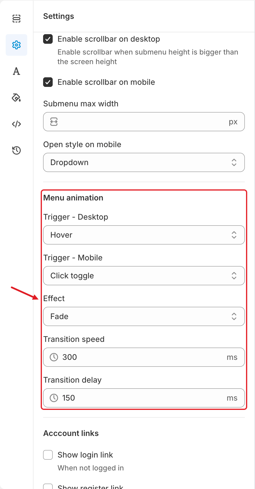
The Menu animation settings
**Submenu**
| Setting | What it does |
| ------------------------------- | --------------------------------------------------------------------------------------------------------------------------------------------------------- |
| **Show border** | Draws a border around submenus. The color is set in **Colors** > **Submenu** > **Border color**. |
| **Enable scrollbar on desktop** | When a submenu is taller than the screen, shoppers can scroll inside it instead of it being cut off. |
| **Enable scrollbar on mobile** | Same as above, for the mobile menu. |
| **Submenu max width** | Maximum width of submenus in px. Leave it empty for the default width. |
| **Open style on mobile** | **Dropdown** expands the submenu below its parent item. **Slide** opens the submenu as a new panel that slides in, with a way back to the previous level. |
**Menu animation**
| Setting | What it does |
| --------------------- | -------------------------------------------------------------------------------------------------------------------------------------------------------------- |
| **Trigger - Desktop** | How submenus open on desktop: **Hover**, **Click** or **Click toggle** (see below). |
| **Trigger - Mobile** | How submenus open in the mobile menu. The same three options. |
| **Effect** | The opening animation: **Fade** or **Shift up**. |
| **Transition speed** | How long the animation takes, in ms (up to 1500). The screenshot shows `300`. |
| **Transition delay** | A short wait before a submenu opens or closes, in ms (up to 1500). Useful with **Hover** so submenus don't flash open when the mouse just passes over an item. |
What the triggers do:
* **Hover** — the submenu opens when the mouse moves over the item.
* **Click** — the first click (or tap) opens the submenu; clicking the item again while its submenu is open goes to the item's link.
* **Click toggle** — each click opens or closes the submenu. The parent item never goes to its link.
{% hint style="info" %}
With **Trigger - Mobile: Click toggle**, tapping a parent item only opens its submenu. If shoppers also need to reach the parent page, change it to **Click**, or add the parent page as the first link inside the submenu. See [A Menu Item Doesn't Redirect on Mobile](/globo-mega-menu/faqs/why-menu-item-not-redirecting-on-mobile.md).
{% endhint %}
## 👤 Account Links
Account links add customer account shortcuts to the menu. They switch automatically depending on whether the shopper is logged in:
| Setting | Shown when |
| ---------------------- | -------------------------------- |
| **Show login link** | The shopper is **not** logged in |
| **Show register link** | The shopper is **not** logged in |
| **Show account link** | The shopper **is** logged in |
| **Show logout link** | The shopper **is** logged in |
When you tick a link, extra fields appear so you can choose its **icon** and **title** (for example, rename "Login" to "Sign in").
## ↕️ Spacing
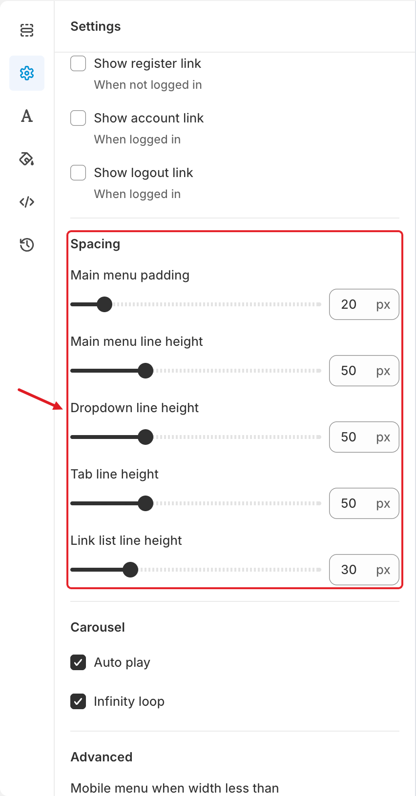
The Spacing settings
Drag the slider or type a value in px:
| Setting | What it does | Default in the screenshot |
| ------------------------- | ------------------------------------------------------------------------------------------- | ------------------------- |
| **Main menu padding** | Horizontal space on each side of every top-level item. Increase it to spread the items out. | 20 px |
| **Main menu line height** | Height of the top-level menu bar. | 50 px |
| **Dropdown line height** | Height of each row in a dropdown submenu. | 50 px |
| **Tab line height** | Height of each tab in a tabbed menu. | 50 px |
| **Link list line height** | Height of each link inside a link list block. | 30 px |
## 🎠 Carousel
For blocks that slide, such as product carousels and the image slider:
* **Auto play** — slides move on their own.
* **Infinity loop** — after the last slide, the carousel starts again from the first.
## 🔧 Advanced
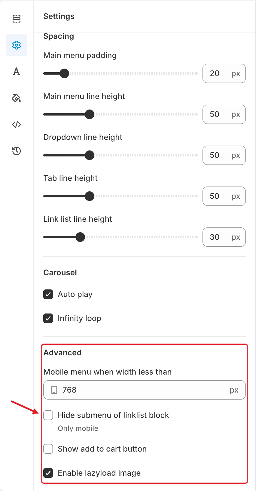
The Advanced settings
| Setting | What it does |
| ------------------------------------ | --------------------------------------------------------------------------------------------------------------------------------------------------------------------------- |
| **Mobile menu when width less than** | Screen width (in px) below which the mobile menu is used. The screenshot shows `768`: screens narrower than 768 px get the mobile menu. |
| **Hide submenu of linklist block** | **Only mobile.** Collapses the links under each link list heading in the mobile menu. Shoppers tap the heading's arrow to expand them, which keeps long mobile menus short. |
| **Show add to cart button** | Shows an add-to-cart button on products shown in the menu's product blocks. Its colors are set in **Colors** > **Add to cart button**. |
| **Enable lazyload image** | Loads menu images only when they're needed, which helps page speed. We recommend keeping it on. |
{% hint style="warning" %}
**The mobile menu doesn't appear on a tablet or small laptop?** Check **Mobile menu when width less than**. The desktop menu is used on any screen that is wider than this value.
{% endhint %}
***
### Related Articles
{% content-ref url="/pages/QE8B60KCTUmW2hXn75BF" %}
[Adjust Menu Font](/globo-mega-menu/adjust-menu-styling/adjust-menu-font.md)
{% endcontent-ref %}
{% content-ref url="/pages/uIc9BwQoCgt6BXeUB7aY" %}
[Adjust Menu Colors](/globo-mega-menu/adjust-menu-styling/adjust-menu-colors.md)
{% endcontent-ref %}
{% content-ref url="/pages/BtejsCo8DyYok4eGTxPy" %}
[Custom CSS](/globo-mega-menu/adjust-menu-styling/custom-css.md)
{% endcontent-ref %}
{% content-ref url="/pages/GicujsB7qcB0s3MYM7JU" %}
[Publish New Menu to Theme](/globo-mega-menu/basic-knowledge/publish-new-menu-to-theme.md)
{% endcontent-ref %}
***
**💬 Need help?**
Email us at **📧** [**contact@globo.io**](mailto:contact@globo.io) - we’re happy to assist!