> For the complete documentation index, see [llms.txt](https://docs.globo.io/llms.txt). Markdown versions of documentation pages are available by appending `.md` to page URLs; this page is available as [Markdown](https://docs.globo.io/globo-mega-menu/basic-knowledge/publish-new-menu-to-theme/replace-navigation.md).
# Replace Navigation
Replace a specific Shopify navigation menu that your theme uses.
Use **Replace existing menu** when [Automatically replace](/globo-mega-menu/basic-knowledge/publish-new-menu-to-theme/automatic.md) doesn't pick the right menu — for example, when your header shows a navigation other than *Main menu*, or when you want different Shopify menus replaced on desktop and mobile.
You tell the app which Shopify navigation (from **Online Store** > **Navigation**) your theme displays. The app then finds the menu on your storefront whose links match that navigation and replaces it with your Globo menu.
## Steps to Set Up
{% stepper %}
{% step %}
### Find out which navigation your header uses
In Shopify admin, go to **Online Store** > **Themes** > **Customize**, click the **Header** section and check which menu is selected (for example *Main menu*). Some themes have a separate setting for the mobile menu.
{% endstep %}
{% step %}
### Select Replace existing menu
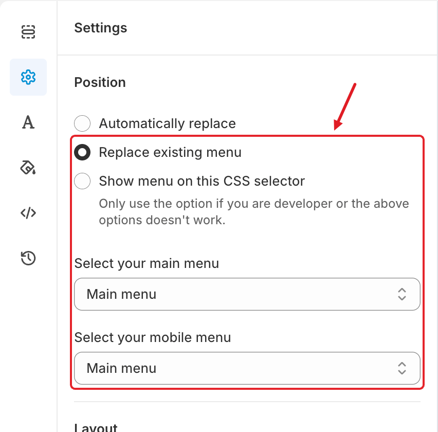
In the menu editor, click the **Settings** tab (⚙️) and under **Position** choose **Replace existing menu**. Two drop-down lists appear.
Replace existing menu with its two menu lists
{% endstep %}
{% step %}
### Choose the menus to replace
* **Select your main menu** — the Shopify navigation your theme shows on **desktop** (usually *Main menu*).
* **Select your mobile menu** — the navigation shown in the **mobile** menu. On most themes this is the same as the desktop one.
When you first choose this option, both lists are set to the first navigation in your store — double-check them.
{% endstep %}
{% step %}
### Save and publish
Click **Save**, then **Publish**. Check your storefront on desktop and mobile.
{% endstep %}
{% endstepper %}
## ⚠️ Troubleshooting
{% hint style="warning" %}
**The menu lists are empty?** Your storefront is probably **password-protected**, so the app can't read your navigation. You'll see *Please remove store front password to update menu list* — click **Remove store password** (it opens **Online Store** > **Preferences**), remove the password and try again.
{% endhint %}
* **The menu still doesn't replace the header:** the app matches your header's links with the selected navigation. If the theme header shows different links (for example, hard-coded links or a different navigation than the one you chose), no match is found. Pick the navigation that the header really uses, or switch to [Show menu on this CSS selector](/globo-mega-menu/basic-knowledge/publish-new-menu-to-theme/show-menu-on-this-css-selector.md).
* **Replaced on desktop but not on mobile (or vice versa):** set **Select your mobile menu** to the navigation used by your theme's mobile drawer.
***
### Related Articles
{% content-ref url="/pages/Q2gH8NAZJrE1nCavAehy" %}
[Automatic](/globo-mega-menu/basic-knowledge/publish-new-menu-to-theme/automatic.md)
{% endcontent-ref %}
{% content-ref url="/pages/f4oQERys4to2Q0QUV7xu" %}
[Show Menu on This CSS Selector](/globo-mega-menu/basic-knowledge/publish-new-menu-to-theme/show-menu-on-this-css-selector.md)
{% endcontent-ref %}
{% content-ref url="/pages/xrVVZ40v8dnp0dB2SnP5" %}
[The Menu Doesn't Show (or Shows Incorrectly)](/globo-mega-menu/faqs/why-the-menu-does-not-show-or-shows-incorrectly-on-our-website.md)
{% endcontent-ref %}
***
**💬 Need help?**
Email us at **📧** [**contact@globo.io**](mailto:contact@globo.io) - we’re happy to assist!