> For the complete documentation index, see [llms.txt](https://docs.globo.io/llms.txt). Markdown versions of documentation pages are available by appending `.md` to page URLs; this page is available as [Markdown](https://docs.globo.io/globo-mega-menu/basic-knowledge/publish-new-menu-to-theme/show-menu-on-this-css-selector.md).
# Show Menu on This CSS Selector
Place the menu on exact CSS selectors in your theme.
With **Show menu on this CSS selector**, you tell the app exactly which element(s) of your theme to fill with the menu, using CSS selectors. The app places your Globo menu **inside** every element that matches, replacing its content.
Use this method when [Automatically replace](/globo-mega-menu/basic-knowledge/publish-new-menu-to-theme/automatic.md) and [Replace existing menu](/globo-mega-menu/basic-knowledge/publish-new-menu-to-theme/replace-navigation.md) don't work (custom or heavily edited themes), or when you want the menu somewhere specific — or only on desktop or only on mobile.
{% hint style="info" %}
As the app says: *Only use the option if you are developer or the above options doesn't work.* It requires a basic understanding of CSS selectors. If you're not comfortable with it, contact us — we install the menu for free.
{% endhint %}
## Steps to Set Up
{% stepper %}
{% step %}
### Select Show menu on this CSS selector
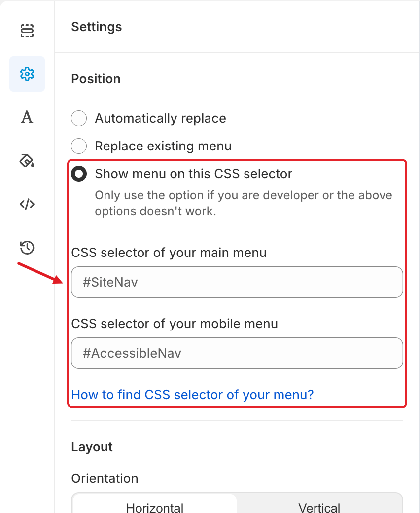
In the menu editor, click the **Settings** tab (⚙️) and under **Position** choose **Show menu on this CSS selector**. Two text fields appear.
Show menu on this CSS selector with its two selector fields
{% endstep %}
{% step %}
### Enter the selectors
* **CSS selector of your main menu** — the element of your **desktop** menu, for example `#SiteNav`, `.header__inline-menu` or `nav.main-menu`.
* **CSS selector of your mobile menu** — the element of your **mobile** menu, for example `#AccessibleNav` or `.menu-drawer`.
Not sure what to enter? See **How to Find a CSS Selector** below, or click **How to find CSS selector of your menu?** under the fields.
{% hint style="warning" %}
The grey `#SiteNav` and `#AccessibleNav` shown in empty fields are only **placeholders**, not saved values. Type your own selectors.
{% endhint %}
{% endstep %}
{% step %}
### Save and publish
Click **Save**, then **Publish**. Check your storefront on desktop and mobile.
{% endstep %}
{% endstepper %}
## 💡 Tips
* **Several selectors:** separate them with commas, e.g. `.header__inline-menu, .sticky-header nav`. The menu is placed in every matching element.
* **Desktop only:** fill in the main menu selector and leave the mobile selector **empty**. Your theme's own mobile menu stays as it is.
* **Mobile only:** leave the main menu selector empty and fill in the mobile one.
* **One element for both:** if your theme uses the same element for desktop and mobile, enter the same selector in both fields. The app switches that element between the desktop and mobile layout based on screen size.
* **Pick the container, not a single link.** The selector should match the element that wraps the whole menu (usually a `