> For the complete documentation index, see [llms.txt](https://docs.globo.io/llms.txt). Markdown versions of documentation pages are available by appending `.md` to page URLs; this page is available as [Markdown](https://docs.globo.io/globo-mega-menu/manage-menu-items/manage-submenu-items/apply-masonry-layout.md).
# Apply Masonry Layout
Arrange columns of different heights neatly, Pinterest-style.
{% hint style="info" %}
Masonry (**Group of items**) and the **Special menu** template are available on the **Pro Navigation** plan.
{% endhint %}
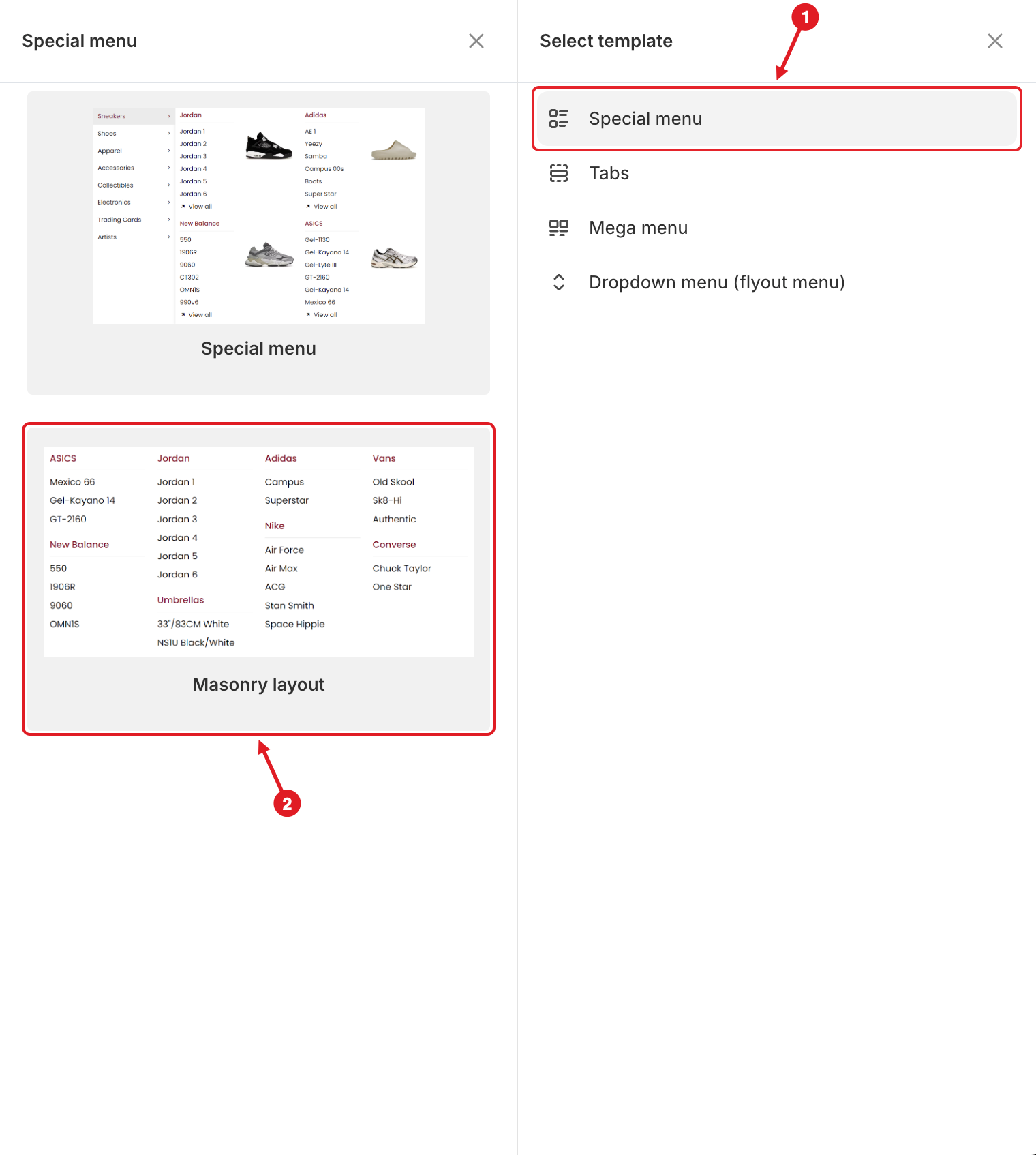
In a normal mega menu, each block sits in its own column, so a short link list leaves an empty gap under it. A **masonry layout** fixes this: you group several blocks into one column, and they stack on top of each other. For example, *ASICS* and *New Balance* share the first column, and *Adidas* and *Nike* share the third.
Both masonry and the Special menu are in the **Special menu** group of **Select template**:
1. Point to the Special menu group · 2. Choose the Masonry layout template
| Template | What you get |
| ------------------ | --------------------------------------------------------------------------------------------------------------------------------- |
| **Special menu** | A category list on the left. Each category has its own panel of link lists and images on the right, like large marketplace menus. |
| **Masonry layout** | Four columns (**Group of items** blocks) with link lists stacked inside each column. |
## Method 1: Start From the Masonry Template
{% stepper %}
{% step %}
### Add the template
In the **Elements** tree, click **Add submenu** under the top-level item. In **Select template**, point to the **Special menu** group (1), then click **Select** on the **Masonry layout** template (2), as shown in the image at the top of this page.
{% endstep %}
{% step %}
### Edit the sample content
The template adds 4 **Group of items** blocks at **25%** width each, with link lists inside. Hover over each heading or link, click ✏️ and change its **Title** and **Link**.
{% endstep %}
{% step %}
### Add or remove blocks in a column
Inside a group, click **Add block** to stack another block (for example another link list or an image) in that column. To remove one, hover over it and click **Delete Item**.
{% endstep %}
{% step %}
### Save and publish
Click **Save** in the top bar, then **Publish**.
{% endstep %}
{% endstepper %}
## Method 2: Build Masonry From a Blank Mega Menu
{% stepper %}
{% step %}
### Add a blank mega menu
Click **Add submenu** > **Mega menu** > **Select** on **Blank**. You can also use an existing mega menu.
{% endstep %}
{% step %}
### Add Group of items blocks
Click **Add block**, choose **Multi block** and select **Group of items**. Repeat for each column you want. Each group becomes one column, so 4 groups give 4 columns.
In the **Elements** tree, groups are shown as **Group of items (Masonry grid layout)**.
{% endstep %}
{% step %}
### Set the group widths
A new group is **50%** wide. Open each group (✏️) and set its **Width** so the columns fit in one row, for example **25%** for 4 columns or **33.33%** for 3 columns.
{% endstep %}
{% step %}
### Add content inside each group
Inside each group, click **Add block** and add the blocks for that column. Set each inner block's **Width** to **100%** so the blocks stack on top of each other instead of sitting side by side.
{% endstep %}
{% step %}
### Save and publish
Click **Save** in the top bar, then **Publish**.
{% endstep %}
{% endstepper %}
## Use the Special Menu Template
{% stepper %}
{% step %}
### Add the template
Click **Add submenu** > **Special menu** > **Select** on **Special menu**.
{% endstep %}
{% step %}
### Edit the categories and panels
Each category on the left is a tab. Rename the categories, then fill each category's panel with blocks using **Add block**. See [Tabbed Menu](/globo-mega-menu/manage-menu-items/manage-submenu-items/tabbed-menu.md) for how tabs work.
{% endstep %}
{% step %}
### Save and publish
Click **Save** in the top bar, then **Publish**.
{% endstep %}
{% endstepper %}
{% hint style="warning" %}
**Columns sit side by side instead of stacking?** Check that the inner blocks are **inside** a **Group of items** in the **Elements** tree, and that their **Width** is **100%**. If the groups wrap onto a second row, lower the group widths so they add up to 100% or less.
{% endhint %}
***
### Related Articles
{% content-ref url="/pages/f5H2ZdBdZILUk8k7C2Xo" %}
[Mega Menu](/globo-mega-menu/manage-menu-items/manage-submenu-items/mega-menu.md)
{% endcontent-ref %}
{% content-ref url="/pages/tijc2NMtByMgkQkH1lzx" %}
[Tabbed Menu](/globo-mega-menu/manage-menu-items/manage-submenu-items/tabbed-menu.md)
{% endcontent-ref %}
{% content-ref url="/pages/lUHoSham1OxSYk97Xx5H" %}
[Blocks Overview](/globo-mega-menu/menu-blocks/blocks.md)
{% endcontent-ref %}
***
**💬 Need help?**
Email us at **📧** [**contact@globo.io**](mailto:contact@globo.io) - we’re happy to assist!