> For the complete documentation index, see [llms.txt](https://docs.globo.io/llms.txt). Markdown versions of documentation pages are available by appending `.md` to page URLs; this page is available as [Markdown](https://docs.globo.io/globo-mega-menu/manage-menu-items/manage-submenu-items/tabbed-menu.md).
# Tabbed Menu
Let shoppers switch between groups inside one submenu.
{% hint style="info" %}
Tabbed menus are available on the **Pro Navigation** plan.
{% endhint %}
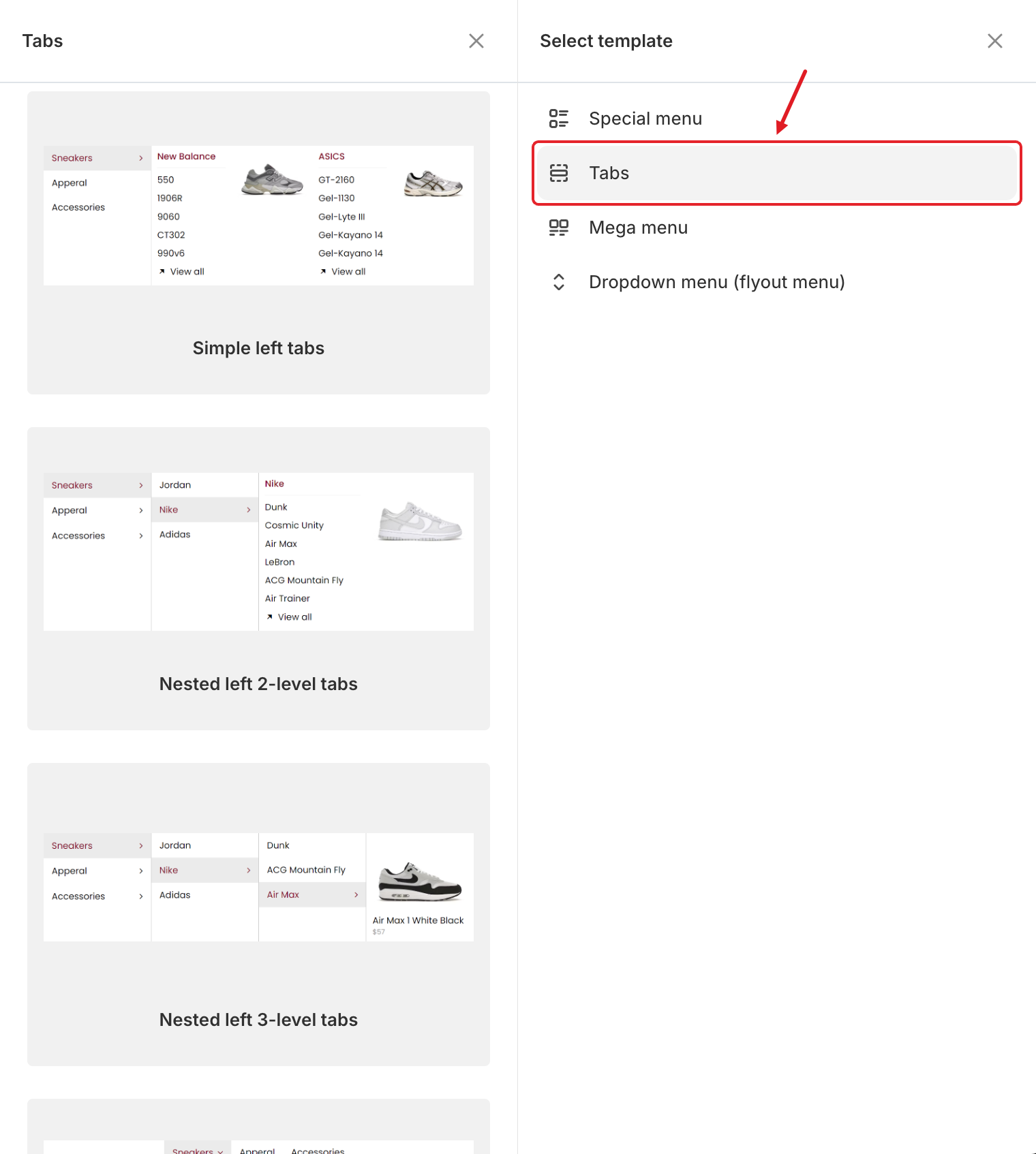
A tabbed menu shows a list of tab titles (for example *Sneakers*, *Apparel*, *Accessories*) and the content of the selected tab next to it. Shoppers switch between tabs inside one submenu, so you can fit a large catalog into a compact panel.
Tab templates
## 📐 Templates
There are 9 tab templates: three depths in three positions.
| Depth | Left | Top | Right |
| ------------------------------------------------------ | ------------------------ | ----------------------- | ------------------------- |
| **Simple**: one row of tabs, each with its own content | Simple left tabs | Simple top tab | Simple right tabs |
| **2-level**: each tab contains its own set of tabs | Nested left 2-level tabs | Nested top tabs 2 level | Nested right tabs 2 level |
| **3-level**: tabs inside tabs inside tabs | Nested left 3-level tabs | Nested top tabs 3 level | Nested right tabs 3 level |
For example, **Nested left 2-level tabs** shows *Sneakers → Jordan / Nike / Adidas → products of Nike*.
## Add a Tabbed Menu
{% stepper %}
{% step %}
### Choose a tab template
In the **Elements** tree, click **Add submenu** under the top-level item. In **Select template**, point to **Tabs** and scroll through the templates. Click **Select** on the one you want.
{% endstep %}
{% step %}
### Rename the tabs
Each tab title is an item. Hover over it in the preview or the **Elements** tree, click ✏️ and change its **Title**.
To add another tab, click **Add tabs** under the tabs in the **Elements** tree.
{% endstep %}
{% step %}
### Fill each tab
Each tab has its own content. Select a tab and click **Add block** to add link lists, images, products and more. See [Blocks Overview](/globo-mega-menu/menu-blocks/blocks.md).
{% endstep %}
{% step %}
### Adjust the tabs block (optional)
Open the tabs block settings (✏️ on the tabs block) to change:
* **Width**: how much of the panel the tabs block uses (**Auto** or 8.33%–100%).
* **Position**: where the tab titles are shown: **Left**, **Top** or **Right**.
{% endstep %}
{% step %}
### Save and publish
Click **Save** in the top bar, then **Publish**.
{% endstep %}
{% endstepper %}
## 💡 Tips
* **Left** tabs work best for long lists of categories. **Top** tabs suit 3–6 short titles.
* You can also add tabs *inside* a mega menu next to other blocks: click **Add block** in a mega menu and choose **Tab**. See [Blocks Overview](/globo-mega-menu/menu-blocks/blocks.md).
* Keep tab titles short so they don't wrap onto two lines.
***
### Related Articles
{% content-ref url="/pages/La331S2qopj8nJM5dm65" %}
[Submenus](/globo-mega-menu/manage-menu-items/manage-submenu-items.md)
{% endcontent-ref %}
{% content-ref url="/pages/f5H2ZdBdZILUk8k7C2Xo" %}
[Mega Menu](/globo-mega-menu/manage-menu-items/manage-submenu-items/mega-menu.md)
{% endcontent-ref %}
{% content-ref url="/pages/lUHoSham1OxSYk97Xx5H" %}
[Blocks Overview](/globo-mega-menu/menu-blocks/blocks.md)
{% endcontent-ref %}
***
**💬 Need help?**
Email us at **📧** [**contact@globo.io**](mailto:contact@globo.io) - we’re happy to assist!