> For the complete documentation index, see [llms.txt](https://docs.globo.io/llms.txt). Markdown versions of documentation pages are available by appending `.md` to page URLs; this page is available as [Markdown](https://docs.globo.io/options/option-types/shared-settings/collapsible-layouts-and-sliders.md).

# Collapsible layouts and sliders

Configure custom layouts, scrolling, and sliders to display long lists of option values in a smaller space.

Use custom layouts to control how option values are displayed. You can collapse long lists, add scrolling, or display values in a slider.

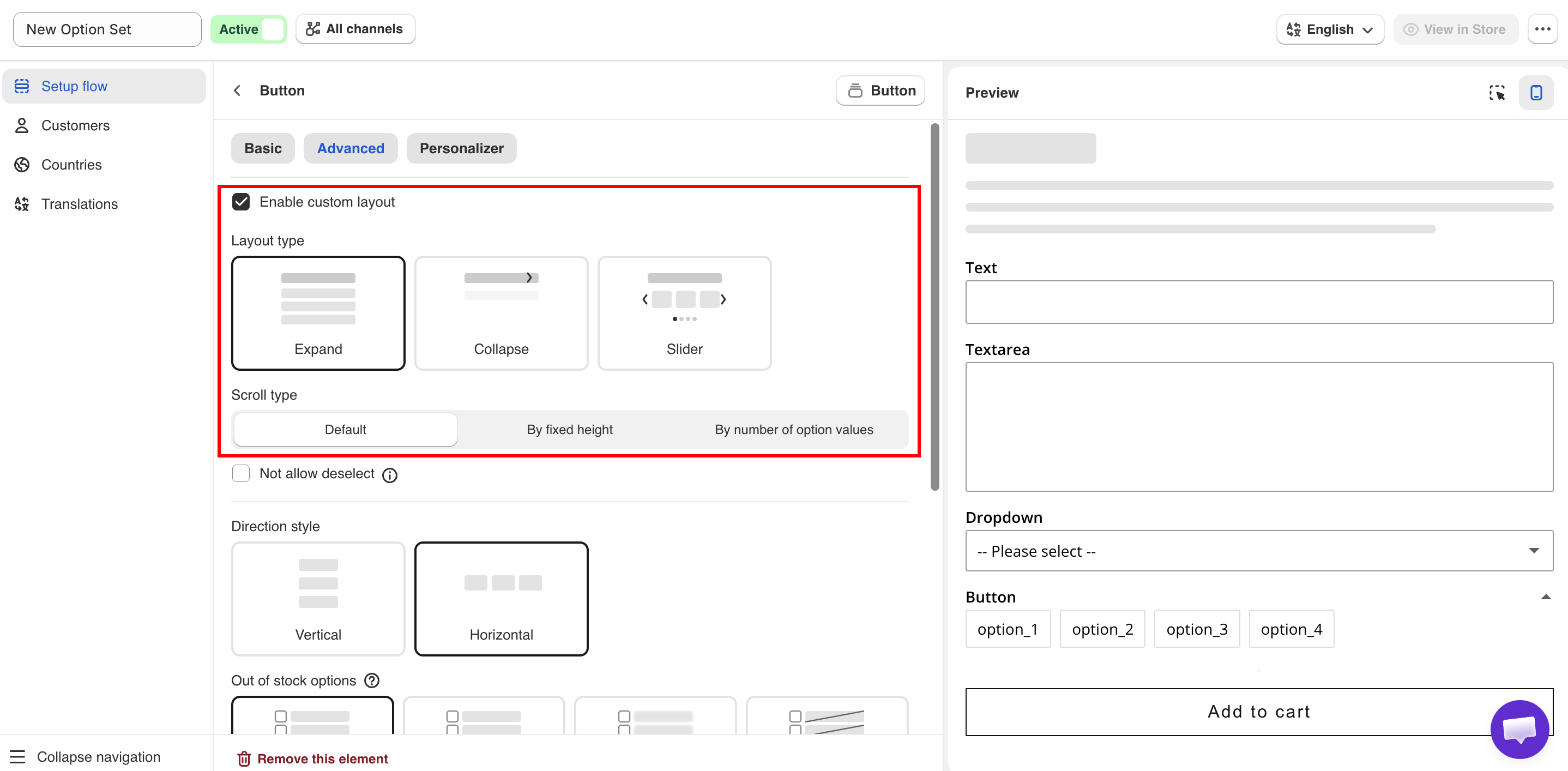
These settings are available on the **Advanced** tab. Turn on **Enable custom layout** to access them.

## Enable custom layout

Off by default. When disabled, all option values are displayed in the default layout. When enabled, you can select a **Layout type**.

<figure><img src="https://3141646361-files.gitbook.io/~/files/v0/b/gitbook-x-prod.appspot.com/o/spaces%2FkMyxhAk2ZlJa4wZQGfBI%2Fuploads%2Fgit-blob-2d32b3d31bd184d46d8268b0b52cf578a0d78ac5%2Flayout.png?alt=media" alt="Slider settings for an Image swatch option"><figcaption><p>Turning on Enable custom layout reveals the Layout type choices.</p></figcaption></figure>

## Layout type

Sets how the option values are displayed.

<table><thead><tr><th width="230">Value</th><th>Description</th></tr></thead><tbody><tr><td><strong>Expand</strong> (default)</td><td>The values are displayed in an expanded list. Customers can collapse it.</td></tr><tr><td><strong>Collapse</strong></td><td>The values are hidden. Customers click to expand the list.</td></tr><tr><td><strong>Slider</strong></td><td>The values are displayed in a horizontal slider.</td></tr></tbody></table>

Use **Collapse** for optional or less frequently used options. Use **Slider** when an option has many visual values.

{% hint style="warning" %}
Avoid using **Collapse** for required options. Customers may not open the collapsed option and can miss a required selection.
{% endhint %}

## Scroll type

Limits the height of the option values. Available when **Layout type** is **Expand** or **Collapse**.

<table><thead><tr><th width="290">Value</th><th>Description</th></tr></thead><tbody><tr><td><strong>Default</strong></td><td>All values are displayed without scrolling.</td></tr><tr><td><strong>By fixed height</strong></td><td>Sets a fixed height in pixels. Displays the <strong>Scroll height</strong> setting.</td></tr><tr><td><strong>By number of option values</strong></td><td>Displays a set number of values before scrolling. Displays the <strong>Number of option values</strong> setting.</td></tr></tbody></table>

**By number of option values** is more reliable, because the height of a value can differ between devices and themes.

## Slider settings

Available when **Layout type** is **Slider**. Availability may depend on your plan.

<table><thead><tr><th width="250">Setting</th><th width="130">Default</th><th>Description</th></tr></thead><tbody><tr><td><strong>Number of rows</strong></td><td><code>1</code></td><td>Number of rows displayed in the slider.</td></tr><tr><td><strong>Swatches per row</strong></td><td><code>3</code></td><td>Number of swatches in each row. A decimal such as <code>4.5</code> displays part of the next swatch.</td></tr><tr><td><strong>Show navigation arrows</strong></td><td><strong>Hide</strong></td><td>Displays previous and next arrows.</td></tr><tr><td><strong>Show indicators</strong></td><td><strong>Hide</strong></td><td>Displays indicators below the slider.</td></tr><tr><td><strong>Slider style</strong></td><td><strong>Style 1</strong></td><td>Selects the arrow style. Available when <strong>Show navigation arrows</strong> is <strong>Show</strong>.</td></tr></tbody></table>

{% hint style="info" %}
We recommend enabling **Show navigation arrows** or **Show indicators** so customers can see that more option values are available.
{% endhint %}
