> For the complete documentation index, see [llms.txt](https://docs.globo.io/llms.txt). Markdown versions of documentation pages are available by appending `.md` to page URLs; this page is available as [Markdown](https://docs.globo.io/options/option-types/shared-settings/selection-behaviour.md).

# Selection behaviour

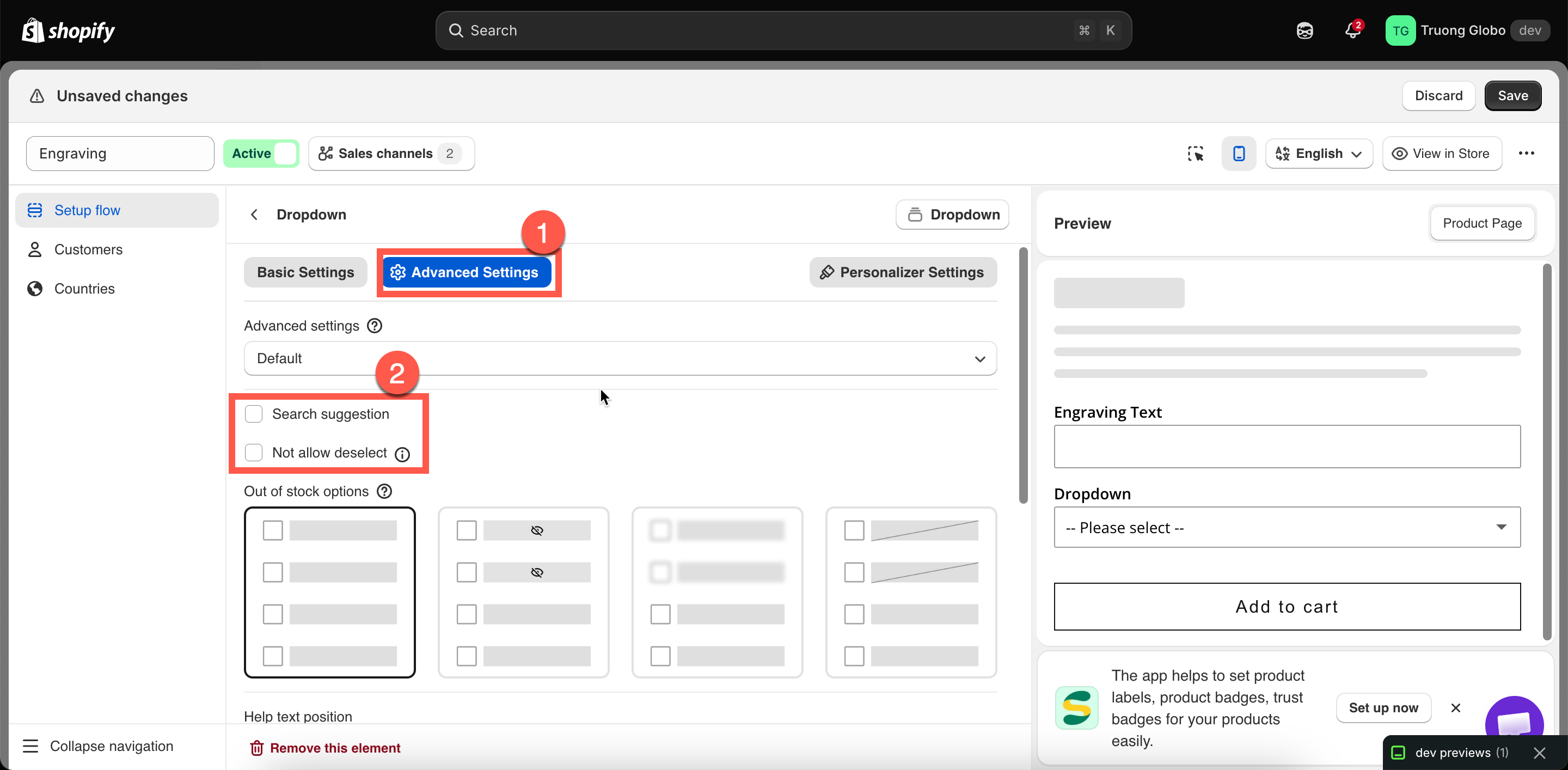
Allow multiple, Not allow deselect, and Search suggestion — settings that control how selection options behave when customers interact with them.

Three settings that change how a selection option responds to customer clicks. **Allow multiple** is the most important: it enables additional settings and changes how add-on pricing works.

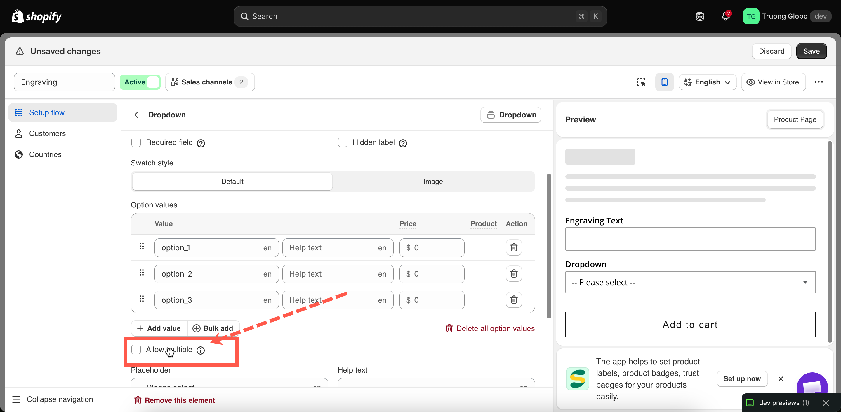
## Allow multiple

Lets the customer choose more than one value.

<table><thead><tr><th width="180">Tab</th><th>Basic</th></tr></thead><tbody><tr><td>Default</td><td>Off</td></tr><tr><td>Available on</td><td>Select, Dropdown, Color dropdown, Image dropdown, Button, Color swatch, Image swatch. It is also available on <strong>File upload</strong>, where it allows customers to upload multiple files rather than select multiple values.</td></tr></tbody></table>

{% hint style="info" %}
**Checkbox** is inherently multi-select, so it does not have this setting. **Radio button** is inherently single-select, so it does not have it either. The setting is available on option types that can support either single or multiple selections.
{% endhint %}

**What turning it on changes**

<table><thead><tr><th width="290">Effect</th><th>Detail</th></tr></thead><tbody><tr><td>The customer can select several values</td><td>Selecting a second value no longer clears the first.</td></tr><tr><td><a href="/options/option-types/shared-settings/limits.md#min-and-max-selections">Min selections</a> and <a href="/options/option-types/shared-settings/limits.md#min-and-max-selections">Max selections</a> appear</td><td>They are meaningless on a single-select option, so they stay hidden until now.</td></tr><tr><td><a href="#not-allow-deselect">Not allow deselect</a> disappears</td><td>It only applies to single-select options.</td></tr><tr><td><strong>Default value</strong> accepts several values</td><td>You can preselect more than one.</td></tr><tr><td>Add-on pricing adds up</td><td>Every selected value with a price contributes. A customer picking three paid extras pays for three.</td></tr><tr><td><strong>Mixed quantity</strong> becomes available</td><td>An advanced add-on mode that gives each value its own quantity box. See <a href="/options/add-on-pricing/advanced-add-on-modes.md">Advanced add-on modes</a>.</td></tr></tbody></table>

**On File upload**

The setting is labeled accordingly and allows customers to upload up to 20 files. Turning it on reveals **Min number of files** and **Max number of files**. See [File upload](/options/option-types/input-types/file-upload.md).

**Choosing between multi-select types**

<table><thead><tr><th width="260">You want</th><th>Use</th></tr></thead><tbody><tr><td>A plain list of extras to tick</td><td><strong>Checkbox</strong></td></tr><tr><td>Several choices without a long list on the page</td><td><strong>Dropdown</strong> with Allow multiple</td></tr><tr><td>Several colors or finishes, shown visually</td><td><strong>Color swatch</strong> or <strong>Image swatch</strong> with Allow multiple</td></tr><tr><td>Several choices as prominent buttons</td><td><strong>Button</strong> with Allow multiple</td></tr></tbody></table>

## Not allow deselect

Once a customer makes a selection, they cannot clear it — they can only switch to another value.

<table><thead><tr><th width="180">Tab</th><th>Advanced</th></tr></thead><tbody><tr><td>Default</td><td>Off</td></tr><tr><td>Available on</td><td>Dropdown, Color dropdown, Image dropdown, Button, Color swatch, Image swatch - only if <strong>Allow multiple</strong> is off</td></tr></tbody></table>

**Why it exists**

On these option types, clicking the currently selected value normally clears the selection, leaving nothing selected. That is useful for optional extras but can be problematic for mandatory choices — a customer who accidentally clears their size selection has to notice and select it again.

Turning this on means that once the customer has made a selection, they cannot return the option to an unselected state.

**When to use it**

* A mandatory choice such as size, finish, or material.
* Any option where “nothing selected” is not a valid answer.
* Together with a **Default value**, when you want the option to start with a selection and prevent it from being cleared.

**When not to use it**

* Optional paid extras. If a customer selects a $20 upgrade and then changes their mind, they should be able to remove it. Preventing that can lead to complaints and refunds.

{% hint style="info" %}
**Not allow deselect** is not the same as **Required field**. Required blocks **Add to cart** when nothing is selected; this setting prevents the customer from clearing an existing selection. They work well together for mandatory choices.
{% endhint %}

## Search suggestion

Adds a search box to the top of a dropdown so the customer can type to filter.

<table><thead><tr><th width="180">Tab</th><th>Advanced</th></tr></thead><tbody><tr><td>Default</td><td>Off</td></tr><tr><td>Available on</td><td>Dropdown, Color dropdown, Image dropdown, Font picker</td></tr></tbody></table>

**How it behaves**

* The dropdown gains a search field, and typing narrows the list of values.
* The search prompt is store-wide and editable — `Search...` in **Settings > Translations**. See [Translate widget text](/options/translations-and-languages/translate-widget-text.md).
* It searches only the values you defined; it does not search your product catalog.

**When to use it**

Once a list grows beyond roughly fifteen values, scrolling can become the slowest part of the purchase. Turn it on for:

* Long color or finish lists.
* Country, region, or city lists.
* Font lists — the **Font picker** benefits especially, since customers often arrive knowing the font name.
* Long lists of compatible models or sizes.

For shorter lists, it adds a control customers may not need. Consider whether a [collapsible layout or slider](/options/option-types/shared-settings/collapsible-layouts-and-sliders.md) would suit the list better instead.

<figure><img src="https://3141646361-files.gitbook.io/~/files/v0/b/gitbook-x-prod.appspot.com/o/spaces%2FkMyxhAk2ZlJa4wZQGfBI%2Fuploads%2Fgit-blob-8e4fa1136d173c29c9980639a54d18339fc38540%2F2026-08-31_10-48-59.png?alt=media" alt="A Dropdown&#x27;s Basic tab with Allow multiple highlighted below the values table"><figcaption><p>Allow multiple is on the Basic tab, directly below the values table.</p></figcaption></figure>

<figure><img src="https://3141646361-files.gitbook.io/~/files/v0/b/gitbook-x-prod.appspot.com/o/spaces%2FkMyxhAk2ZlJa4wZQGfBI%2Fuploads%2Fgit-blob-0802ca603624097f7179802c49d67f73fb278b8f%2F2026-08-31_10-47-22.png?alt=media" alt="Allow multiple on the Basic tab, with Search suggestion and Not allow deselect on the Advanced tab"><figcaption><p>Allow multiple is a Basic setting; the other two are Advanced.</p></figcaption></figure>