> For the complete documentation index, see [llms.txt](https://docs.globo.io/llms.txt). Markdown versions of documentation pages are available by appending `.md` to page URLs; this page is available as [Markdown](https://docs.globo.io/options/storefront-display-and-design/colors.md).

# Colors

Every color setting in the widget, grouped as the app groups them.

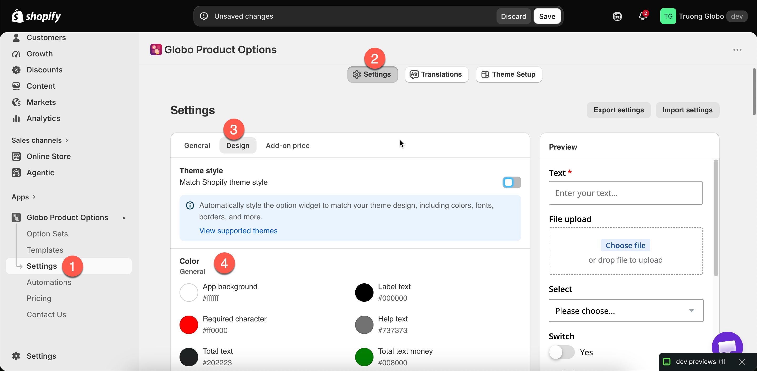
**Settings** > **Settings** > **Design** > **Color**. Store-wide, applying to every option set.

Before setting these individually, try [Match your theme style](/options/storefront-display-and-design/match-your-theme-style.md). For a supported theme, it sets most of them for you.

<figure><img src="https://3141646361-files.gitbook.io/~/files/v0/b/gitbook-x-prod.appspot.com/o/spaces%2FkMyxhAk2ZlJa4wZQGfBI%2Fuploads%2Fgit-blob-23f58e9c8fee82a0fbd2dc713ae630e7097953bb%2F2026-09-07_11-12-42.png?alt=media" alt="The Color group in Design settings with its sub-groups of color fields"><figcaption><p>The Color group in Design settings, grouped as the app groups it.</p></figcaption></figure>

## General

<table><thead><tr><th width="290">Setting</th><th>Colors</th></tr></thead><tbody><tr><td><strong>App background</strong></td><td>The widget's own background. Usually left matching your page background</td></tr><tr><td><strong>Label text</strong></td><td>Option labels</td></tr><tr><td><strong>Required character</strong></td><td>The marker on required options. Traditionally red — make sure it is visible against your background</td></tr><tr><td><strong>Help text</strong></td><td>Help text under and around options</td></tr><tr><td><strong>Total text</strong></td><td>The add-on total's label</td></tr><tr><td><strong>Total text money</strong></td><td>The amount itself. Often a green or your brand color</td></tr></tbody></table>

## Inputs

Covers text fields, number fields, switches, and range sliders.

<table><thead><tr><th width="290">Setting</th><th>Colors</th></tr></thead><tbody><tr><td><strong>Input text</strong></td><td>What the customer types</td></tr><tr><td><strong>Input border</strong></td><td>The field's outline</td></tr><tr><td><strong>Input background</strong></td><td>Inside the field</td></tr><tr><td><strong>Switch background</strong></td><td>A switch when off</td></tr><tr><td><strong>Switch active background</strong></td><td>A switch when on</td></tr><tr><td><strong>Range slider thumb</strong></td><td>The slider handle</td></tr><tr><td><strong>Range slider background</strong></td><td>The unfilled track</td></tr><tr><td><strong>Range slider active background</strong></td><td>The filled part of the track</td></tr></tbody></table>

## Choices

Covers dropdowns, checkboxes, and radio buttons.

<table><thead><tr><th width="290">Setting</th><th>Colors</th></tr></thead><tbody><tr><td><strong>Dropdown text</strong></td><td>Text in a dropdown</td></tr><tr><td><strong>Dropdown border</strong></td><td>Its outline</td></tr><tr><td><strong>Dropdown background</strong></td><td>Inside it</td></tr><tr><td><strong>Dropdown selected</strong></td><td>The highlight on the chosen entry</td></tr><tr><td><strong>Checkbox &#x26; Radio text</strong></td><td>Their labels at rest</td></tr><tr><td><strong>Checkbox &#x26; Radio text hover</strong></td><td>On hover</td></tr><tr><td><strong>Checkbox &#x26; Radio text active</strong></td><td>When selected</td></tr><tr><td><strong>Checkbox &#x26; Radio hover</strong></td><td>The control on hover</td></tr><tr><td><strong>Checkbox &#x26; Radio active</strong></td><td>The control when selected</td></tr></tbody></table>

## Swatches

Covers buttons, color swatches, and image swatches.

<table><thead><tr><th width="290">Setting</th><th>Colors</th></tr></thead><tbody><tr><td><strong>Button text</strong> / <strong>hover</strong> / <strong>active</strong></td><td>Button labels in each state</td></tr><tr><td><strong>Button background</strong> / <strong>hover</strong> / <strong>active</strong></td><td>Button fills in each state</td></tr><tr><td><strong>Swatch border</strong></td><td>A swatch at rest</td></tr><tr><td><strong>Swatch border hover</strong></td><td>On hover</td></tr><tr><td><strong>Swatch border active</strong></td><td>When selected</td></tr></tbody></table>

{% hint style="info" %}
**Swatch border active** is the most important color in this group because it shows the customer which swatch is selected. Make it clearly different from the resting state. A subtle difference is easy to miss, especially on a phone.
{% endhint %}

## Tabs

For the [Tabs](/options/option-types/static-types/tabs.md) option type.

<table><thead><tr><th width="290">Setting</th><th>Colors</th></tr></thead><tbody><tr><td><strong>Tab title</strong></td><td>Inactive tab titles</td></tr><tr><td><strong>Tab title active</strong></td><td>The open tab's title</td></tr><tr><td><strong>Tab title hover</strong></td><td>On hover</td></tr><tr><td><strong>Tab content</strong></td><td>The text inside a panel</td></tr><tr><td><strong>Tab border</strong></td><td>The lines around and between tabs</td></tr></tbody></table>

## Group

For [Section](/options/option-types/static-types/section.md) headings.

<table><thead><tr><th width="290">Setting</th><th>Colors</th></tr></thead><tbody><tr><td><strong>Group label</strong></td><td>The section heading text</td></tr><tr><td><strong>Group icon</strong></td><td>The section's prefix icon</td></tr><tr><td><strong>Group chevron</strong></td><td>The open and close arrow on a collapsible section</td></tr></tbody></table>

## Matching your theme's colors

{% stepper %}
{% step %}

### Try Match theme style first

On a supported theme, it sets most of these colors at once. See [Match your theme style](/options/storefront-display-and-design/match-your-theme-style.md).
{% endstep %}

{% step %}

### Copy exact values from your theme's settings

Open your theme's own color settings and copy the values, rather than selecting colors that look similar.
{% endstep %}

{% step %}

### Set the three states for anything interactive

Buttons and swatches have rest, hover, and active states. Leaving one at its default is the most common reason a widget still looks out of place.
{% endstep %}

{% step %}

### Check contrast

Check label text against the app background, and the required marker against every background it appears on.
{% endstep %}

{% step %}

### Check a real product page and a phone

Use **View in Store**. The builder preview does not use your theme's styling.
{% endstep %}
{% endstepper %}

## Notes

* These settings are store-wide. There is no per-option-set color scheme. To style one option set differently, use an [HTML class](/options/option-types/shared-settings/direction-width-and-css.md#html-class) and [custom CSS](/options/storefront-display-and-design/custom-css.md).
* These settings work alongside **Match theme style**, so you can turn on the switch and then adjust individual colors.
* These colors apply to the storefront widget. The builder preview uses the app's own styling.
