> For the complete documentation index, see [llms.txt](https://docs.globo.io/llms.txt). Markdown versions of documentation pages are available by appending `.md` to page URLs; this page is available as [Markdown](https://docs.globo.io/options/storefront-display-and-design/widget-behavior.md).

# Widget behavior

Alignment, tooltips, showing the selected value, and limiting the widget's height.

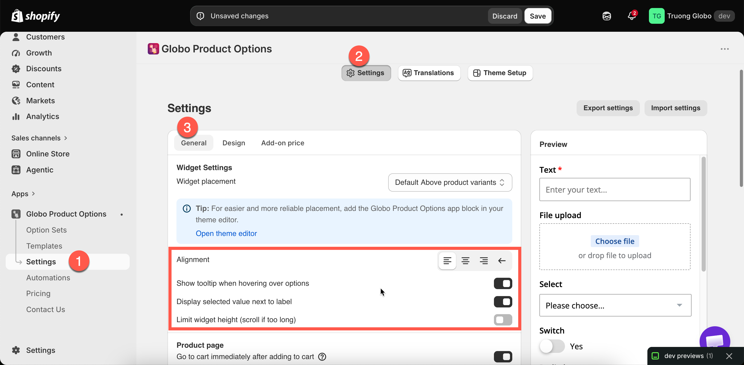
Four settings in **Settings** > **Settings** > **General** > **Widget Settings** control how the widget behaves rather than how it looks. All of them are store-wide.

## Alignment

<table><thead><tr><th width="180">Tab</th><th>General > Widget Settings</th></tr></thead><tbody><tr><td>Default</td><td><strong>Left</strong></td></tr></tbody></table>

<table><thead><tr><th width="230">Choice</th><th>Behavior</th></tr></thead><tbody><tr><td><strong>Left</strong></td><td>Left-aligned. Correct for left-to-right languages</td></tr><tr><td><strong>Center</strong></td><td>Centered, in either reading direction</td></tr><tr><td><strong>Right</strong></td><td>Right-aligned without changing reading direction</td></tr><tr><td><strong>Right to left</strong></td><td>Full right-to-left layout, for Arabic and Hebrew storefronts</td></tr></tbody></table>

**Right to left** changes the layout of the entire widget, not just the text alignment. See [Right-to-left and non-Latin text](/options/translations-and-languages/rtl-and-non-latin.md).

## Show tooltip when hovering over options

| Default | On |
| ------- | -- |

Displays the option value's name when a customer hovers over a swatch. Without it, swatch names are not shown anywhere.

Keep this on. In a grid of color swatches, the tooltip is the only way a customer can see what each color is called.

[Image swatch](/options/option-types/selection-types/image-swatch.md) can also display a zoomed image in its tooltip, set per option. See [Tooltip style](/options/option-types/shared-settings/swatch-style-and-previews.md#tooltip-style).

{% hint style="warning" %}
Touch devices do not have a hover state. Put anything a mobile customer needs to know in per-value help text rather than in a tooltip. See [Working with option values](/options/option-sets/option-values.md).
{% endhint %}

## Display selected value next to label

| Default | On |
| ------- | -- |

Displays the selected value beside the option's label, for example `Color: Sage` rather than just `Color`.

Keep this on, particularly for swatches. It confirms the selection in words rather than only by highlighting a swatch, so customers can check their choices before adding to cart.

## Limit widget height

| Default | Off |
| ------- | --- |

Turning it on displays **Fixed height**, a value in pixels. The widget is limited to that height and scrolls inside it.

<table><thead><tr><th width="290">Use it when</th><th>Avoid it when</th></tr></thead><tbody><tr><td>A very long option set pushes <strong>Add to cart</strong> far down the page</td><td>The widget is a reasonable length already</td></tr><tr><td>Your theme's layout needs a predictable height</td><td>You have not tried <a href="/options/option-types/static-types/section.md">Sections</a> and <a href="/options/conditional-logic/conditional-logic.md">conditional logic</a> first</td></tr></tbody></table>

{% hint style="info" %}
A scrollbar inside a page that also scrolls is confusing, and customers miss options inside it, particularly on a phone.

Try these first: group options into collapsible [Sections](/options/option-types/static-types/section.md), display options only when they are relevant using [conditional logic](/options/conditional-logic/conditional-logic.md), use [collapsible layouts or sliders](/options/option-types/shared-settings/collapsible-layouts-and-sliders.md) for long value lists, and set [column widths](/options/option-types/shared-settings/direction-width-and-css.md#column-width) so short fields share a row.

All four make the form shorter. A height limit only hides part of it.
{% endhint %}

<figure><img src="https://3141646361-files.gitbook.io/~/files/v0/b/gitbook-x-prod.appspot.com/o/spaces%2FkMyxhAk2ZlJa4wZQGfBI%2Fuploads%2Fgit-blob-f02ca8e44c07664b99f29284ea690fddd78bbe13%2F2026-09-07_11-17-41.png?alt=media" alt="The widget behavior settings for alignment, tooltips, selected value, and height limit"><figcaption><p>Four behavior settings, all store-wide.</p></figcaption></figure>

## Two related settings

These two are in the same section:

<table><thead><tr><th width="290">Setting</th><th>What it does</th></tr></thead><tbody><tr><td><strong>Auto-scroll to first error message</strong></td><td>Under <strong>Product page</strong>. On by default. Scrolls the page to the first problem when add to cart is blocked. Keep it on — without it a customer sees nothing happen</td></tr><tr><td><strong>File preview</strong></td><td>Under <strong>Product page</strong>. Whether an uploaded image shows as a thumbnail or a link. See <a href="/options/option-types/input-types/file-upload.md">File upload</a></td></tr></tbody></table>

## Notes

* All four settings are store-wide and apply to every option set.
* Alignment cannot be set per language. If you sell in both left-to-right and right-to-left languages, use [custom CSS](/options/storefront-display-and-design/custom-css.md).
* These are behavior settings. Appearance settings are in **Design**. See [Colors](/options/storefront-display-and-design/colors.md) and [Borders and typography](/options/storefront-display-and-design/borders-and-typography.md).
