> For the complete documentation index, see [llms.txt](https://docs.globo.io/llms.txt). Markdown versions of documentation pages are available by appending `.md` to page URLs; this page is available as [Markdown](https://docs.globo.io/options/option-types/static-types/pop-up-modal.md).

# Pop-up modal

A link that opens formatted content in a dialog, so long explanations do not lengthen the page.

A link on the product page that opens a dialog with your content. The information is available to customers who want it, without taking up space for everyone else.

Use it for care instructions, personalization policies, return terms, delivery details, or anything important that not every customer needs to read.

## How to add Image to Pop-up Modal and Paragraph

#### Steps to Manage:

1. **Go to Shopify Dashboard**\
   Navigate to: `Content → Files → Upload files`
2. **Upload Your Image**\
   Upload the image file you want to display in your popup or paragraph.
3. **Copy the Image URL**\
   After uploading, copy the image URL provided by Shopify.

<figure><img src="https://3141646361-files.gitbook.io/~/files/v0/b/gitbook-x-prod.appspot.com/o/spaces%2FkMyxhAk2ZlJa4wZQGfBI%2Fuploads%2F72mqukCJNp9kMAVWH9PI%2Fimage.png?alt=media&amp;token=c447876d-7794-4f4c-81df-4206569d3c6c" alt=""><figcaption></figcaption></figure>

4. **Preview the Image**

* Open a new browser tab
* Paste the copied URL
* Right-click on the image
* Select **“Copy image”** (or copy image address)

<figure><img src="https://3141646361-files.gitbook.io/~/files/v0/b/gitbook-x-prod.appspot.com/o/spaces%2FkMyxhAk2ZlJa4wZQGfBI%2Fuploads%2FElBL9tvas6c2O6CHx80o%2Fimage.png?alt=media&amp;token=d68c3973-f503-481b-bc28-cf8490590e6a" alt=""><figcaption></figcaption></figure>

5. **Go to Globo Product Options App**

* Open the **Popup Modal** or **Paragraph** element
* Paste the image tag or URL inside the **content field**

<figure><img src="https://3141646361-files.gitbook.io/~/files/v0/b/gitbook-x-prod.appspot.com/o/spaces%2FkMyxhAk2ZlJa4wZQGfBI%2Fuploads%2FufIux4ck9Tr4vpBCo1GA%2Fimage.png?alt=media&amp;token=d226e97a-fdee-4bd7-9ec7-78cfd0c7a798" alt=""><figcaption></figcaption></figure>

## What customers see

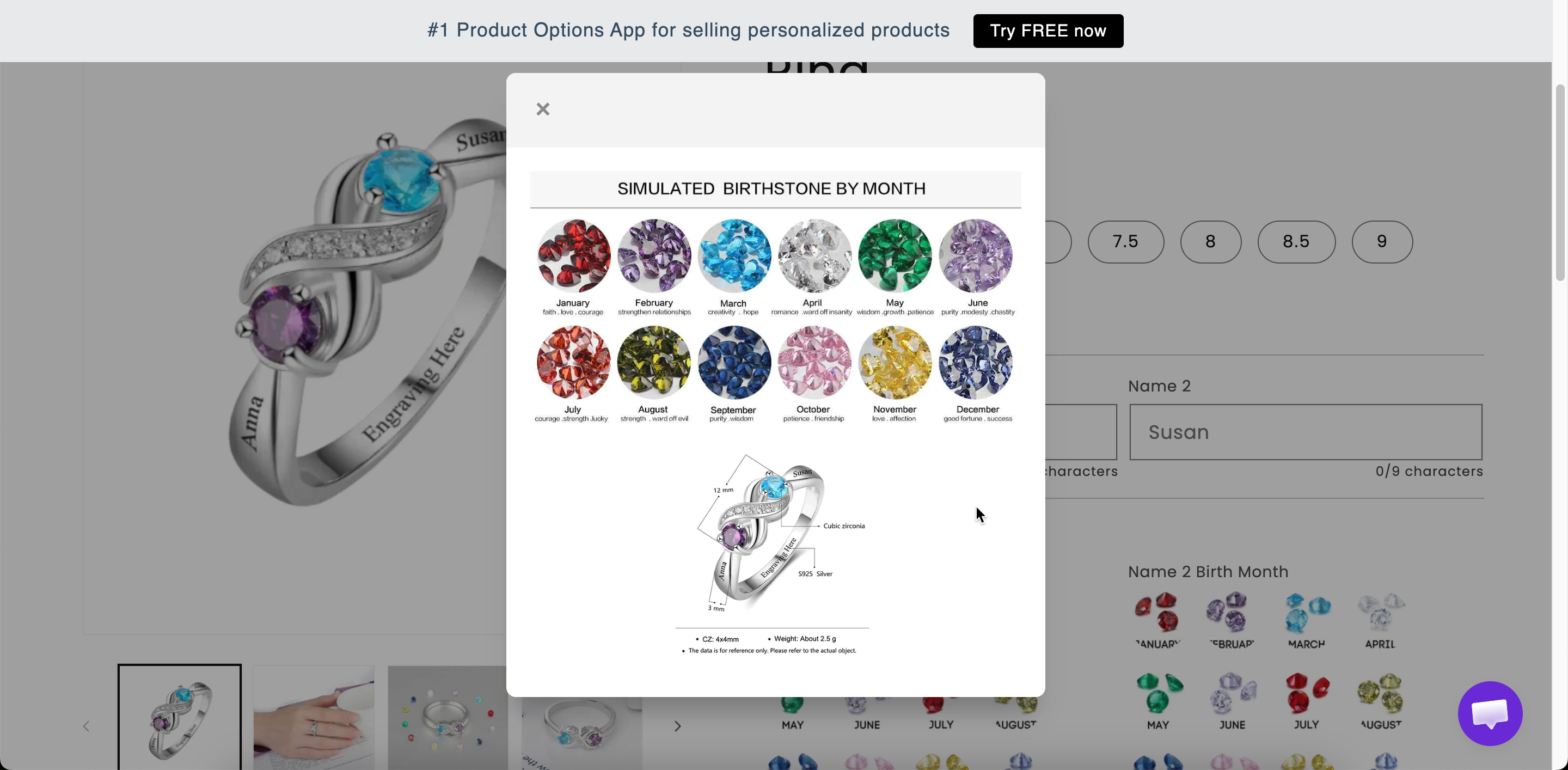
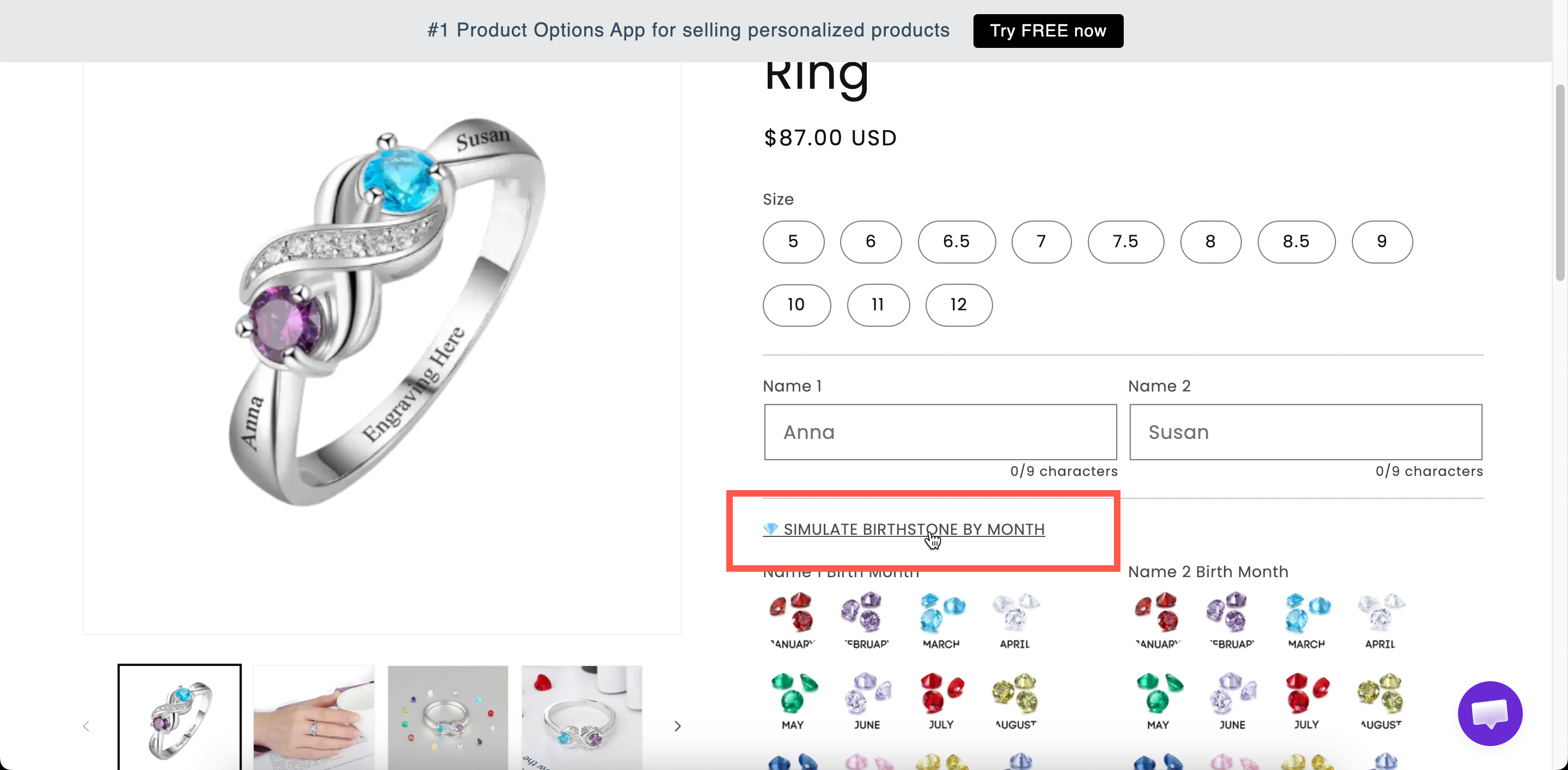
A link with your title. Selecting it opens a dialog with your content, at the width you set.

<figure><img src="https://3141646361-files.gitbook.io/~/files/v0/b/gitbook-x-prod.appspot.com/o/spaces%2FkMyxhAk2ZlJa4wZQGfBI%2Fuploads%2Fgit-blob-147d21647471ef230f117638d92098d2afcf4627%2F2026-09-03_15-39-47.png?alt=media" alt="A pop-up modal link on a storefront product page and the dialog it opens"><figcaption><p>A link on the product page that opens your content in a dialog.</p></figcaption></figure>

<figure><img src="https://3141646361-files.gitbook.io/~/files/v0/b/gitbook-x-prod.appspot.com/o/spaces%2FkMyxhAk2ZlJa4wZQGfBI%2Fuploads%2Fgit-blob-22a1e103d4b4a9fa31bae77dd71c735e15067393%2F2026-09-03_15-38-02.png?alt=media" alt="A pop-up modal opened from a link on a storefront product page"><figcaption><p>A modal keeps long content off the page until it is asked for.</p></figcaption></figure>

## Settings

<table><thead><tr><th width="250">Setting</th><th>What it does</th></tr></thead><tbody><tr><td><strong>Modal title</strong></td><td>The link text on the product page, and the dialog's heading. Starts as <code>Open modal</code>.</td></tr><tr><td><strong>Modal width</strong></td><td>The dialog width in pixels. Starts at <code>600</code>.</td></tr><tr><td><strong>Modal content</strong></td><td>The content, written in a rich-text editor.</td></tr><tr><td><a href="/options/option-types/shared-settings/conditional-logic-and-add-on-fields.md#conditional-logic">Conditional logic</a></td><td>Show or hide the link.</td></tr><tr><td><a href="/options/option-types/shared-settings/direction-width-and-css.md#html-class">HTML class</a> / <a href="/options/option-types/shared-settings/direction-width-and-css.md#column-width">Column width</a></td><td>Styling hook and width of the link, not the dialog.</td></tr></tbody></table>

{% hint style="info" %}
**Modal title** serves two purposes, so write it as a link that clearly tells customers what they will find. `Read our personalization policy` works as both a link and a dialog title; `Open modal` does neither.
{% endhint %}

### Modal width

<table><thead><tr><th width="180">Width</th><th>Suits</th></tr></thead><tbody><tr><td><code>400</code>–<code>500</code></td><td>A few short paragraphs</td></tr><tr><td><code>600</code></td><td>The default. Comfortable for most text</td></tr><tr><td><code>800</code>+</td><td>Content with a table or images</td></tr></tbody></table>

Dialogs are resized to fit narrow screens, so a wide value still works on mobile. A table inside a dialog is cramped on a phone, so use [Size chart](/options/option-types/static-types/size-chart.md) for a size table.

## Modal or Tabs?

<table><thead><tr><th width="230">Pop-up modal</th><th>Tabs</th></tr></thead><tbody><tr><td>One block of content</td><td>Several blocks</td></tr><tr><td>Hidden until opened</td><td>Always on the page, one panel at a time</td></tr><tr><td>Takes one line on the page</td><td>Takes the height of a panel</td></tr><tr><td>Best when most customers skip it</td><td>Best when most customers read at least one panel</td></tr></tbody></table>

If you have several topics to present, such as care, delivery, and returns, [Tabs](/options/option-types/static-types/tabs.md) is usually the better choice. If you have a single policy that only some customers need to read, use a **Popup modal**.

## Examples

**A personalization policy**

<table><thead><tr><th width="290">Setting</th><th>Value</th></tr></thead><tbody><tr><td>Modal title</td><td><code>How personalization works</code></td></tr><tr><td>Modal width</td><td><code>600</code></td></tr><tr><td>Modal content</td><td>Lead times, what can and cannot be engraved, the returns position</td></tr></tbody></table>

**Care instructions**

Title `Care instructions`, with a short formatted list as the content, placed at the bottom of the form.

**A conditional warning**

Title `Important: engraved items cannot be returned`, displayed by conditional logic only when the customer has entered engraving text.

## Notes

* Available on all plans.
* Works in Shopify POS.
* The content can be translated for each storefront language. See [Translate option content](/options/translations-and-languages/translate-option-content.md).
* The rich-text editor covers most formatting needs. Use [HTML](/options/option-types/static-types/html.md) only when you need formatting that the editor does not support.
* A modal is not suitable for information customers must read before making a choice, because they may never open it. Use a [Paragraph](/options/option-types/static-types/paragraph.md) instead.