> For the complete documentation index, see [llms.txt](https://docs.globo.io/llms.txt). Markdown versions of documentation pages are available by appending `.md` to page URLs; this page is available as [Markdown](https://docs.globo.io/options/storefront-display-and-design/borders-and-typography.md).

# Borders and typography

Border weight and corner radius for the three control families, and the four text styles.

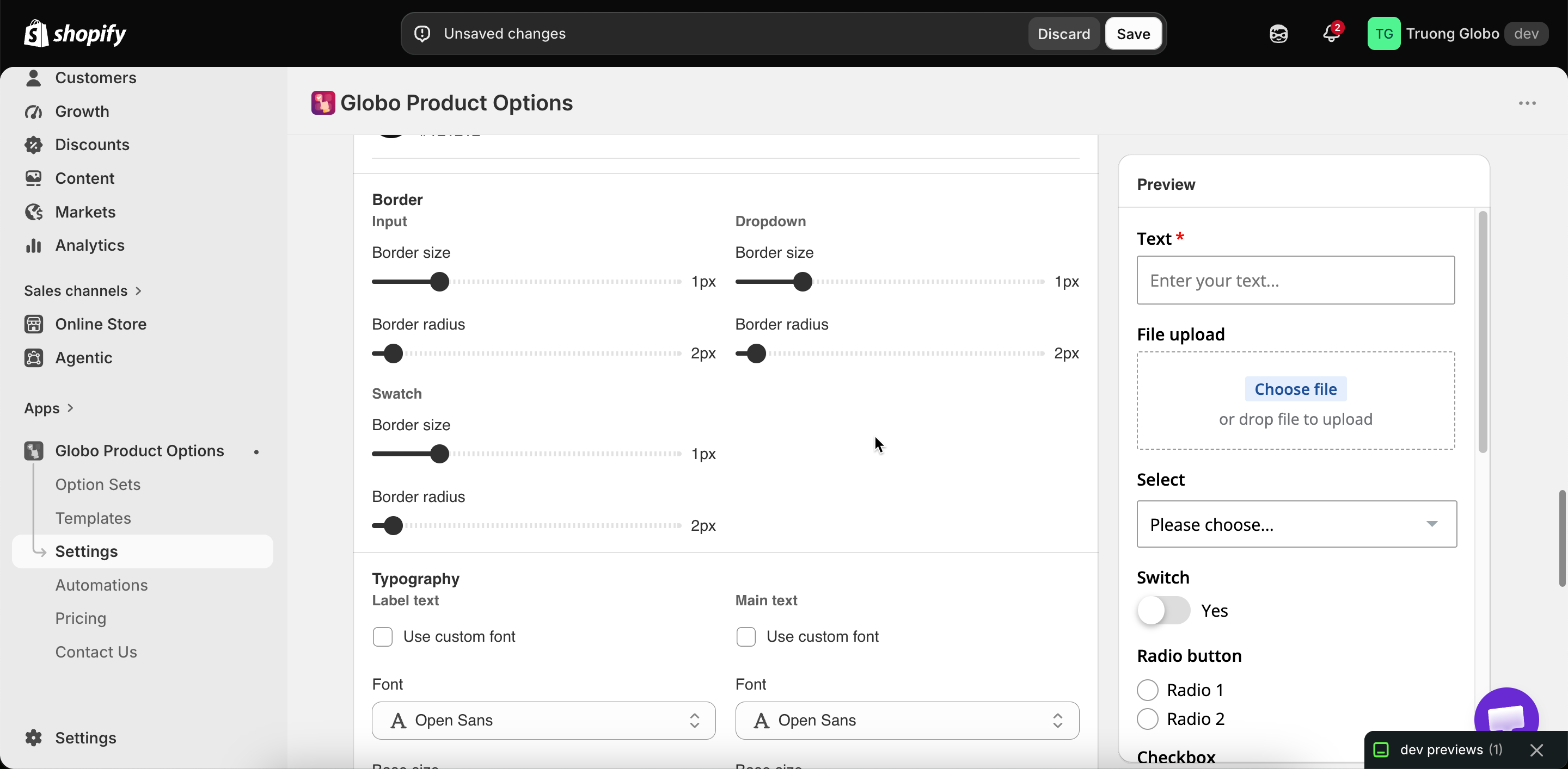
Two groups in **Settings** > **Settings** > **Design**. Both store-wide.

## Borders

Three control families, each with a size and a radius.

<table><thead><tr><th width="230">Family</th><th>Covers</th></tr></thead><tbody><tr><td><strong>Input</strong></td><td>Text fields, number fields, textareas</td></tr><tr><td><strong>Dropdown</strong></td><td>Dropdowns and select fields</td></tr><tr><td><strong>Swatch</strong></td><td>Color and image swatches, and buttons</td></tr></tbody></table>

Each takes:

<table><thead><tr><th width="230">Value</th><th width="150">Default</th><th>What it does</th></tr></thead><tbody><tr><td>Size</td><td><code>1</code></td><td>Border thickness in pixels</td></tr><tr><td>Radius</td><td><code>2</code></td><td>Corner rounding in pixels</td></tr></tbody></table>

### Matching your theme

Border radius is the setting that most often makes the widget look separate from the page. Fully rounded buttons in your theme next to square fields in the widget look wrong even when the colors match.

<table><thead><tr><th width="290">Your theme's controls</th><th>Set radius to roughly</th></tr></thead><tbody><tr><td>Sharp, square corners</td><td><code>0</code></td></tr><tr><td>Slightly softened</td><td><code>2</code> to <code>4</code></td></tr><tr><td>Noticeably rounded</td><td><code>8</code> to <code>12</code></td></tr><tr><td>Pill-shaped</td><td>A large value, around <code>50</code></td></tr></tbody></table>

Copy the values from your theme's own settings.

A thicker **Swatch** border makes the selected state easier to see. See [Colors](/options/storefront-display-and-design/colors.md#swatches).

## Typography

Four text styles, each with a font, a weight or variant, and a size.

<table><thead><tr><th width="230">Style</th><th>Applies to</th></tr></thead><tbody><tr><td><strong>Label text</strong></td><td>Option labels</td></tr><tr><td><strong>Main text</strong></td><td>What the customer types, and option values</td></tr><tr><td><strong>Help text</strong></td><td>Help text throughout</td></tr><tr><td>The fourth style</td><td>The add-on total line</td></tr></tbody></table>

Each style offers:

<table><thead><tr><th width="290">Control</th><th>What it does</th></tr></thead><tbody><tr><td>Font family</td><td>A font from the app's list</td></tr><tr><td>Font variant</td><td>The weight or style — regular, 600, and so on. The available variants depend on the font</td></tr><tr><td>Font size</td><td>In pixels</td></tr><tr><td>Custom font</td><td>Switch to one of your uploaded fonts instead. See <a href="/options/settings/custom-fonts.md">Custom fonts</a></td></tr></tbody></table>

### Setting up typography

{% stepper %}
{% step %}

### Use your theme's fonts, not similar ones

Two similar sans-serif fonts on one page look like a mistake. Match your theme's fonts exactly, or use one font throughout.
{% endstep %}

{% step %}

### Make labels heavier than values

A heavier label with a regular value gives the form a clear reading order. This is why the label style defaults to a heavier variant than the others.
{% endstep %}

{% step %}

### Keep help text smaller, but not too small

Set help text one or two points below the main text. Below about 12 pixels, most customers stop reading it.
{% endstep %}

{% step %}

### Check non-Latin scripts

Many fonts do not include Arabic, Hebrew, Thai, or CJK glyphs, and missing glyphs fall back to a system font. See [Right-to-left and non-Latin text](/options/translations-and-languages/rtl-and-non-latin.md).
{% endstep %}

{% step %}

### Check on a phone

Text that is comfortable on a monitor can be cramped on a phone.
{% endstep %}
{% endstepper %}

<figure><img src="https://3141646361-files.gitbook.io/~/files/v0/b/gitbook-x-prod.appspot.com/o/spaces%2FkMyxhAk2ZlJa4wZQGfBI%2Fuploads%2Fgit-blob-6675b6a6aa9d3a61758d2e4b01230aef1412b7c1%2F2026-09-07_11-14-55.png?alt=media" alt="The border and typography settings groups in the Design tab"><figcaption><p>Border families and text style settings, all store-wide.</p></figcaption></figure>

## Notes

* Both groups work alongside [Match theme style](/options/storefront-display-and-design/match-your-theme-style.md), so you can turn on the switch and then adjust the values here.
* These settings are store-wide, with no per-option-set override. To style one option set differently, use an [HTML class](/options/option-types/shared-settings/direction-width-and-css.md#html-class) and [custom CSS](/options/storefront-display-and-design/custom-css.md).
* The Personalizer's fonts are set per layer and are separate from these. See [Fonts](/options/product-personalizer/layer-settings/fonts.md).
* Custom fonts must be uploaded before they appear here. See [Custom fonts](/options/settings/custom-fonts.md).
