> For the complete documentation index, see [llms.txt](https://docs.globo.io/llms.txt). Markdown versions of documentation pages are available by appending `.md` to page URLs; this page is available as [Markdown](https://docs.globo.io/options/product-personalizer/personalizer.md).

# Overview

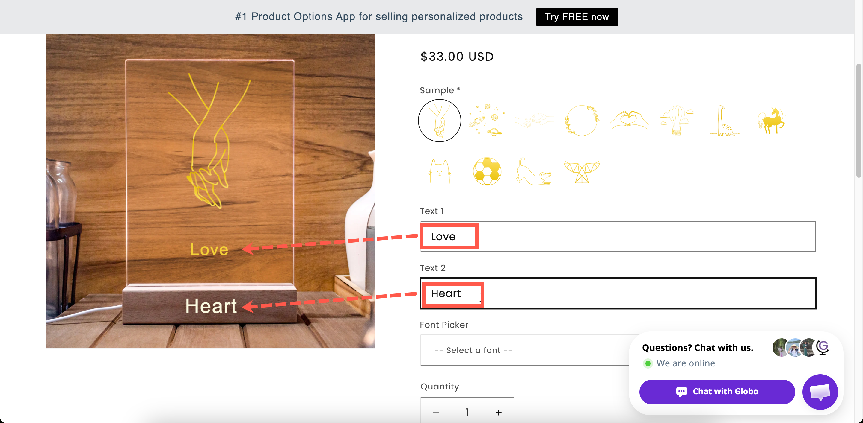
Show the customer's own text and images on the product photo, live, as they type — the app's most persuasive feature.

The **Product Personalizer** displays what customers enter directly on the product image in real time. They type a name and see how it looks engraved. They upload a photo and see it placed in the frame. They choose a color and see the product change instantly.

It turns personalization from something customers have to imagine into something they can see before they buy.

<figure><img src="https://3141646361-files.gitbook.io/~/files/v0/b/gitbook-x-prod.appspot.com/o/spaces%2FkMyxhAk2ZlJa4wZQGfBI%2Fuploads%2Fgit-blob-98600f483b43ad907a61de5af8f3fd564aa23dcb%2F2026-09-04_11-41-39.png?alt=media" alt="A storefront product page with the customer&#x27;s typed text drawn onto the product photo"><figcaption><p>The customer's own words, on the product, before they buy.</p></figcaption></figure>

**Watch it done — 3:48.** Building a live preview from scratch, so customers see their own text on the product image as they type.

{% embed url="<https://www.youtube.com/watch?v=Q8EwrbBIs98>" %}

## What it can draw

<table><thead><tr><th width="230">Layer</th><th width="290">From</th><th>Controls you get</th></tr></thead><tbody><tr><td><strong>Text</strong></td><td><a href="/options/option-types/input-types/text.md">Text</a>, <a href="/options/option-types/input-types/textarea.md">Textarea</a>, <a href="/options/option-types/input-types/number.md">Number</a></td><td>Color, size, style, font, five effects, curve, auto-fit</td></tr><tr><td><strong>Images</strong></td><td><a href="/options/option-types/input-types/file-upload.md">File upload</a> and eight selection types</td><td>Shape masking, fit mode, size</td></tr></tbody></table>

Both kinds share position, opacity, rotation, a crop area, and the choice of what the customer may adjust themselves.

## The twelve supported option types

<table><thead><tr><th width="290">Text layers</th><th>Image layers</th></tr></thead><tbody><tr><td><a href="/options/option-types/input-types/text.md">Text</a></td><td><a href="/options/option-types/input-types/file-upload.md">File upload</a></td></tr><tr><td><a href="/options/option-types/input-types/textarea.md">Textarea</a></td><td><a href="/options/option-types/selection-types/dropdown.md">Dropdown</a></td></tr><tr><td><a href="/options/option-types/input-types/number.md">Number</a></td><td><a href="/options/option-types/selection-types/color-dropdown.md">Color dropdown</a></td></tr><tr><td></td><td><a href="/options/option-types/selection-types/image-dropdown.md">Image dropdown</a></td></tr><tr><td></td><td><a href="/options/option-types/selection-types/radio-button.md">Radio button</a></td></tr><tr><td></td><td><a href="/options/option-types/selection-types/checkbox.md">Checkbox</a></td></tr><tr><td></td><td><a href="/options/option-types/selection-types/button.md">Button</a></td></tr><tr><td></td><td><a href="/options/option-types/selection-types/color-swatch.md">Color swatch</a></td></tr><tr><td></td><td><a href="/options/option-types/selection-types/image-swatch.md">Image swatch</a></td></tr></tbody></table>

Other option types — such as dates, phone numbers, switches, and sliders — do not have a **Personalizer** tab because there is no visual content for the Personalizer to display.

## How to read this section

The order below is the order you would actually build in.

<table data-view="cards"><thead><tr><th></th><th></th><th data-hidden data-card-target data-type="content-ref"></th></tr></thead><tbody><tr><td><strong>Set up the Personalizer</strong></td><td>The background, the layers, and the order to build them in. Start here.</td><td><a href="/options/product-personalizer/setup.md">Set up the Personalizer</a></td></tr><tr><td><strong>Layer settings</strong></td><td>Eight pages covering every setting on a layer: styling, fonts, effects, placement, curve and auto-fit, crop area, image fitting, and customer controls.</td><td><a href="/options/product-personalizer/layer-settings.md">Layer settings</a></td></tr><tr><td><strong>Designs in cart and orders</strong></td><td>What you and the customer see afterwards.</td><td><a href="/options/product-personalizer/cart-and-orders.md">Designs in cart and orders</a></td></tr><tr><td><strong>Walkthrough: custom printed mug</strong></td><td>Follow one real product from empty builder to finished preview.</td><td><a href="/options/product-personalizer/walkthrough-custom-mug.md">Walkthrough: custom printed mug</a></td></tr><tr><td><strong>Troubleshooting</strong></td><td>Find your problem by what you are seeing on the page.</td><td><a href="/options/product-personalizer/troubleshooting.md">Troubleshooting personalizer</a></td></tr></tbody></table>

## Before you start

* **The Personalizer is available on certain plans.** If the **Personalizer** tab is unavailable, see [Compare plans](/options/plans-and-billing/compare-plans.md).
* **Use a good product photograph.** The preview is only as convincing as the image it is applied to — see [Choosing the background](/options/product-personalizer/setup.md#choosing-the-background).
* **Allow time for positioning.** Precisely positioning a layer where the engraving or customization actually appears can take a few minutes per product. Getting this right makes the difference between a convincing preview and an amateur-looking one.

{% hint style="info" %}
The fastest way in is a [personalized template](/options/templates/personalized-templates.md). Twenty complete setups ship with the app, already positioned, and you can adapt one rather than starting from an empty canvas.
{% endhint %}