> For the complete documentation index, see [llms.txt](https://docs.globo.io/llms.txt). Markdown versions of documentation pages are available by appending `.md` to page URLs; this page is available as [Markdown](https://docs.globo.io/options/option-types/selection-types/button.md).

# Button

A row of tappable buttons, the most compact way to display short choices such as sizes, with slider support for long lists.

A row of tappable buttons, with one button per value. Every choice is visible and selectable in one tap, making it ideal for short lists such as sizes.

It’s a familiar pattern for Shopify customers and works especially well on mobile. For longer lists, slider support keeps the options compact.

## What customers see

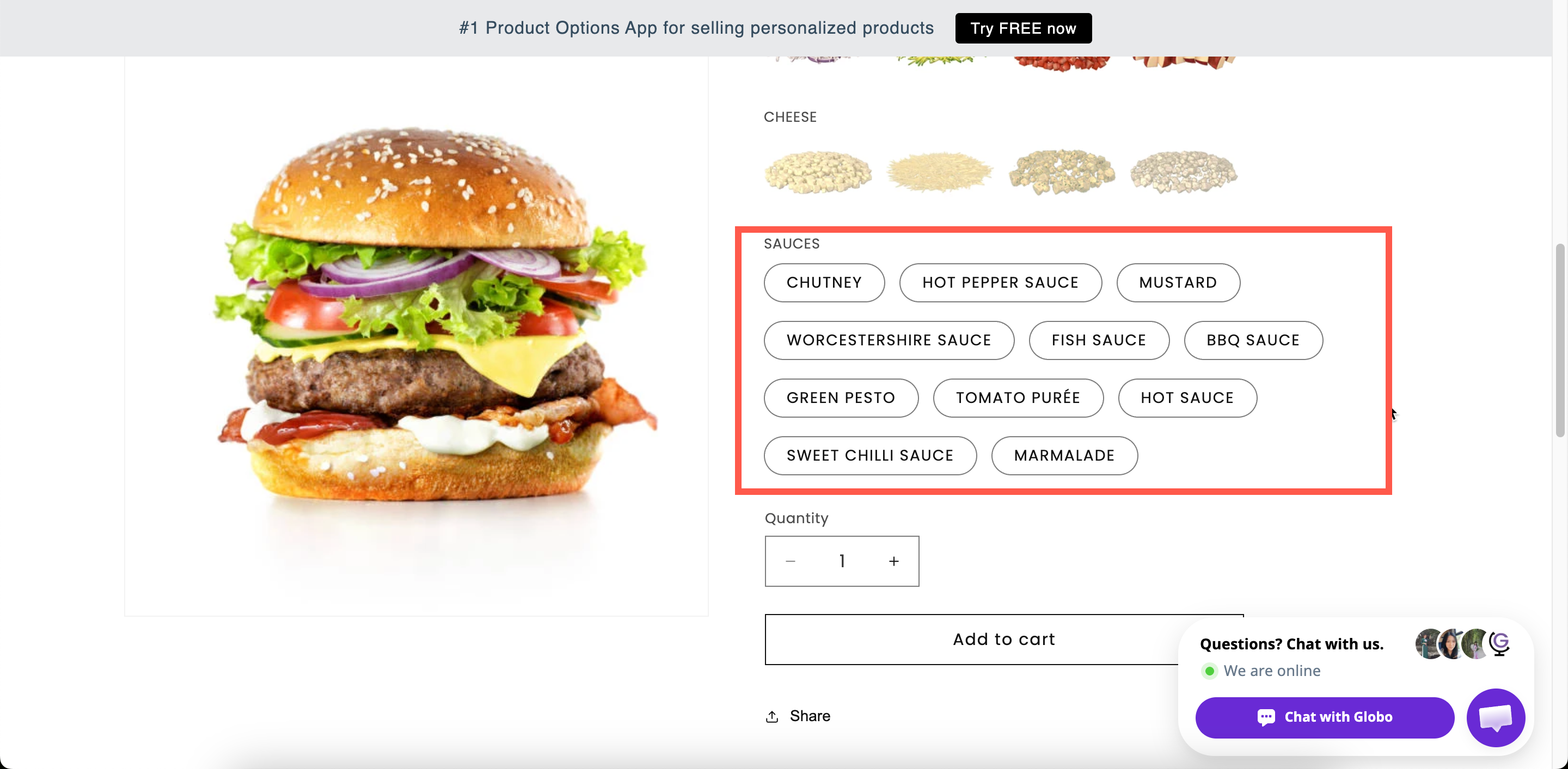
A row of buttons that wrap onto more rows as needed, or a slider if you configure one. With **Swatch style** set to **Image**, each button shows a picture instead of text.

<figure><img src="https://3141646361-files.gitbook.io/~/files/v0/b/gitbook-x-prod.appspot.com/o/spaces%2FkMyxhAk2ZlJa4wZQGfBI%2Fuploads%2Fgit-blob-bd99aa119629aa1352b2da69f5665adc315e7b2c%2F2026-09-03_11-47-32.png?alt=media" alt="A row of size buttons on a storefront product page with one selected and one struck through"><figcaption><p>Short values as buttons — one tap, no opening or scrolling.</p></figcaption></figure>

## Basic

<table><thead><tr><th width="250">Setting</th><th>What it does</th></tr></thead><tbody><tr><td><a href="/options/option-types/shared-settings/labels-and-visibility.md#label">Label</a> / <a href="/options/option-types/shared-settings/labels-and-visibility.md#name">Name</a></td><td>Customer-facing text, and the name on the order.</td></tr><tr><td><a href="/options/option-types/shared-settings/required-and-default-value.md#required-field">Required field</a></td><td>Blocks add to cart until one is chosen.</td></tr><tr><td><a href="/options/option-types/shared-settings/labels-and-visibility.md#hidden-label">Hidden label</a></td><td>Hides the label.</td></tr><tr><td><a href="/options/option-types/shared-settings/swatch-style-and-previews.md#swatch-style">Swatch style</a></td><td><strong>Default</strong> or <strong>Image</strong>.</td></tr><tr><td><strong>Option values</strong></td><td>The choices, with prices and their own help text. See <a href="/options/option-sets/option-values.md">Working with option values</a>.</td></tr><tr><td><a href="/options/option-types/shared-settings/selection-behaviour.md#allow-multiple">Allow multiple</a></td><td>Lets the customer choose several. Reveals the two limits below.</td></tr><tr><td><a href="/options/option-types/shared-settings/limits.md#min-and-max-selections">Min selections</a> / <a href="/options/option-types/shared-settings/limits.md#min-and-max-selections">Max selections</a></td><td>How many they must and may choose.</td></tr><tr><td><a href="/options/option-types/shared-settings/placeholder-and-help-text.md#help-text">Help text</a></td><td>Guidance for the whole option.</td></tr><tr><td><a href="/options/option-types/shared-settings/required-and-default-value.md#default-value">Default value</a></td><td>Preselects one or more values.</td></tr><tr><td><a href="/options/option-types/shared-settings/conditional-logic-and-add-on-fields.md#conditional-logic">Conditional logic</a></td><td>Show or hide based on other choices.</td></tr></tbody></table>

## Advanced

<table><thead><tr><th width="250">Setting</th><th>What it does</th></tr></thead><tbody><tr><td><a href="/options/option-types/shared-settings/conditional-logic-and-add-on-fields.md#add-on-quantity">Add-on quantity</a> / <a href="/options/option-types/shared-settings/conditional-logic-and-add-on-fields.md#quantity">Quantity</a></td><td>How add-ons scale — including <strong>Mixed quantity</strong> when multiple is on.</td></tr><tr><td><a href="/options/option-types/shared-settings/collapsible-layouts-and-sliders.md#enable-custom-layout">Enable custom layout</a></td><td>Unlocks the layouts below.</td></tr><tr><td><a href="/options/option-types/shared-settings/collapsible-layouts-and-sliders.md#layout-type">Layout type</a></td><td><strong>Expand</strong>, <strong>Collapse</strong>, or <strong>Slider</strong>.</td></tr><tr><td><a href="/options/option-types/shared-settings/collapsible-layouts-and-sliders.md#scroll-type">Scroll type</a>, <strong>Scroll height</strong>, <strong>Number of option values</strong></td><td>Scroll area, for the Expand and Collapse layouts.</td></tr><tr><td><a href="/options/option-types/shared-settings/collapsible-layouts-and-sliders.md#slider-settings">Number of rows</a>, <strong>Swatches per row</strong>, <strong>Show navigation arrows</strong>, <strong>Show indicators</strong>, <strong>Slider style</strong></td><td>Slider layout settings.</td></tr><tr><td><a href="/options/option-types/shared-settings/selection-behaviour.md#not-allow-deselect">Not allow deselect</a></td><td>Stops the customer clearing their choice. Single-select only.</td></tr><tr><td><a href="/options/option-types/shared-settings/direction-width-and-css.md#direction-style">Direction style</a></td><td><strong>Vertical</strong> or <strong>Horizontal</strong>.</td></tr><tr><td><a href="/options/option-types/shared-settings/out-of-stock-options.md">Out of stock options</a></td><td>How sold-out values look.</td></tr><tr><td><a href="/options/option-types/shared-settings/placeholder-and-help-text.md#help-text-position">Help text position</a></td><td>Where the option-level help text sits.</td></tr><tr><td><a href="/options/option-types/shared-settings/direction-width-and-css.md#html-class">HTML class</a> / <a href="/options/option-types/shared-settings/direction-width-and-css.md#column-width">Column width</a></td><td>Styling hook and field width.</td></tr></tbody></table>

Button is one of only three types with a **Slider** layout, alongside [Color swatch](/options/option-types/selection-types/color-swatch.md) and [Image swatch](/options/option-types/selection-types/image-swatch.md).

## Personalizer

Supported as an **image layer**. Each value can draw an image onto the product photo when it is selected. The settings are image shape, background mode, size, position, rotation, crop area, and customer controls. See [Image layers](/options/product-personalizer/layer-settings/image-layers.md).

## Add-on pricing

Prices are set on each value. With **Allow multiple** off, one charge applies. With it on, every selected value is charged, and **Mixed quantity** becomes available.

See [Add-on pricing](/options/add-on-pricing/add-on-pricing.md).

## Keep values short

Buttons are sized to fit their text. Short values produce a compact row, and long values produce a stack of full-width blocks, which reads better as a [Radio button](/options/option-types/selection-types/radio-button.md) list.

<table><thead><tr><th width="290">Works well as buttons</th><th>Better as radio buttons</th></tr></thead><tbody><tr><td><code>S</code> <code>M</code> <code>L</code> <code>XL</code></td><td><code>Standard delivery, 3–5 working days</code></td></tr><tr><td><code>10cm</code> <code>15cm</code> <code>20cm</code></td><td><code>Gift wrapped in recycled paper with a ribbon</code></td></tr><tr><td><code>Matt</code> <code>Gloss</code> <code>Satin</code></td><td><code>Premium service including insurance</code></td></tr><tr><td><code>1</code> <code>2</code> <code>3</code> <code>4</code></td><td>Anything needing its own help text</td></tr></tbody></table>

## Examples

**Sizes**

<table><thead><tr><th width="290">Setting</th><th>Value</th></tr></thead><tbody><tr><td>Label / Name</td><td><code>Size</code></td></tr><tr><td>Option values</td><td><code>S</code>, <code>M</code>, <code>L</code>, <code>XL</code>, each linked to an add-on product for stock</td></tr><tr><td>Required field</td><td>On</td></tr><tr><td>Not allow deselect</td><td>On</td></tr><tr><td>Out of stock options</td><td><strong>Strike-through</strong></td></tr><tr><td>Direction style</td><td><strong>Horizontal</strong></td></tr></tbody></table>

**Many sizes, as a slider**

Twenty sizes, with **Enable custom layout** on, **Layout type** set to **Slider**, **Number of rows** `2`, **Swatches per row** `5.5`, and **Show navigation arrows** set to **Show**.

**Quantity bands with prices**

Values `1 pack`, `3 pack`, and `5 pack`, priced through **Existing product** so each one maps to a real SKU.

**Several finishes at once**

**Allow multiple** on, **Max selections** `2`, and **Add-on quantity** set to **Mixed quantity**.

## Notes

* Available on all plans.
* Works in Shopify POS.
* The slider layout may not be available on all plans. See [Compare plans](/options/plans-and-billing/compare-plans.md).
* Per-value help text is supported, but there is little space for it inside a button. Radio button displays it better.
* **Not allow deselect** is hidden when **Allow multiple** is on.
* Values follow the order of the values table. For sizes, order them by size rather than alphabetically.
